
Smart, Search-Driven, Personality-Filled SEO

ContentWorks VT

Creative Direction
Illustration
Typography
Business Cards
A playful visual system designed to make SEO feel approachable, memorable, and impossible to ignore.

ContentWorks VT is a Vermont-based SEO and content strategy agency helping brands improve visibility through thoughtful writing, search strategy, and data-driven storytelling.

The project focused on creating a distinctive set of illustrations and business cards that could help the brand stand out in an industry often dominated by generic marketing visuals and corporate aesthetics. Built around the idea that strong strategy and personality can coexist, the visual direction for ContentWorks VT combined playful illustration, tactile interaction, and approachable typography into a memorable brand experience designed for conferences, networking, and digital touchpoints. The result was a system that felt professional and informed while still reflecting the adventurous, outdoors-inspired personality behind the business.

In a crowded SEO and digital marketing landscape where many brands visually blend together, ContentWorks VT needed a way to feel more approachable, recognizable, and memorable without sacrificing professionalism.

Founder Sasha Weilbaker came from a background in journalism, content writing, and outdoor-industry marketing, bringing a unique blend of storytelling expertise and technical SEO knowledge into her business. The challenge became translating that balance into visuals that could communicate expertise while still feeling human, personable, and distinct from more traditional marketing agencies.

A major focus of the project centered around conference and networking experiences, where the brand needed to make a lasting impression through small but meaningful touchpoints like business cards and supporting collateral.

The visual direction leaned into playful professionalism — combining clean typography, approachable illustration, and tactile interaction to create a brand experience that felt both knowledgeable and inviting.

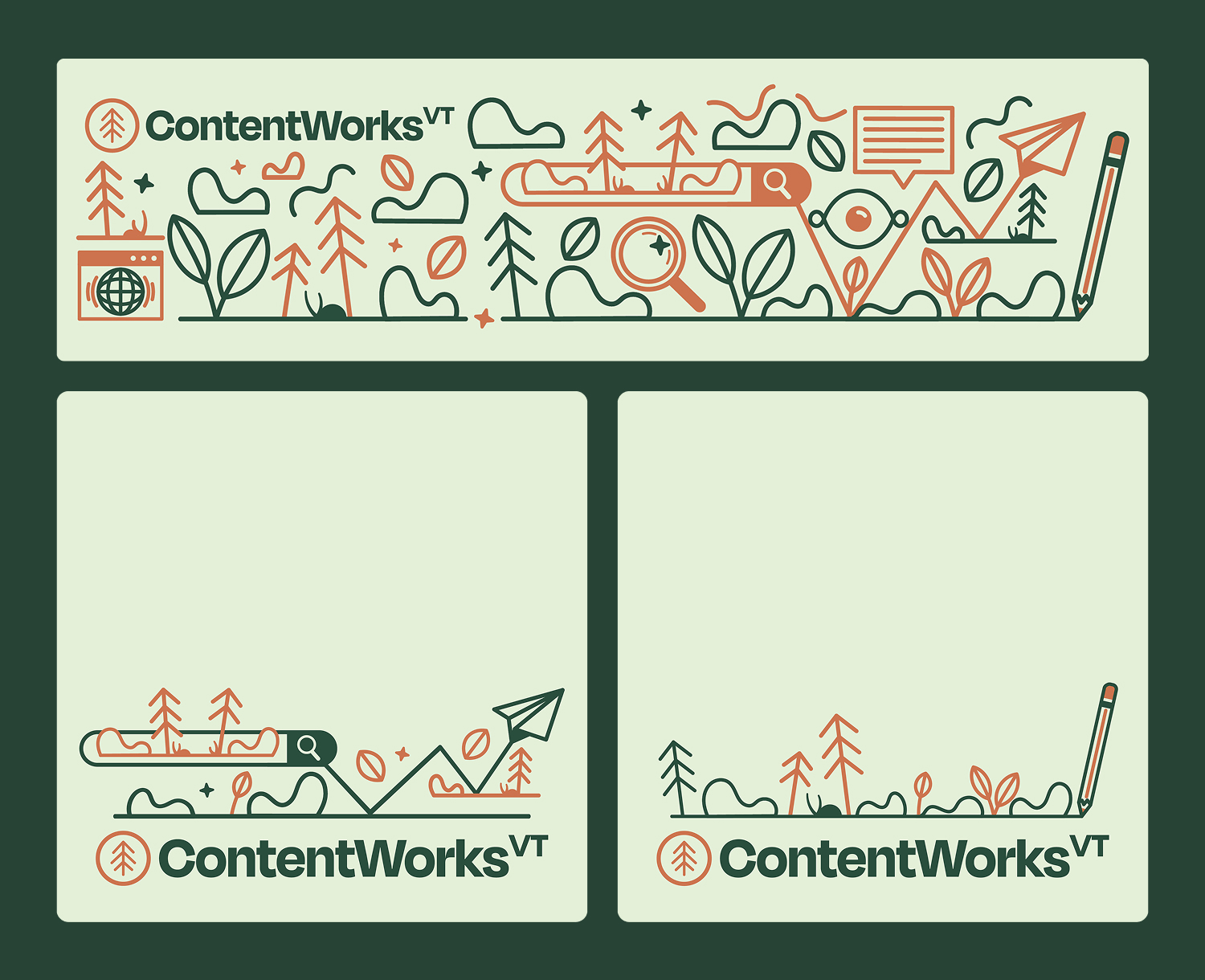
Nature-inspired illustrations referencing Vermont landscapes and Sasha’s outdoor-industry background helped bring warmth and individuality into the system while differentiating the brand from more sterile or overly corporate competitors. Existing logo elements and brand colors were preserved to maintain consistency, while the new illustration suite expanded the visual language into something more expressive and recognizable.

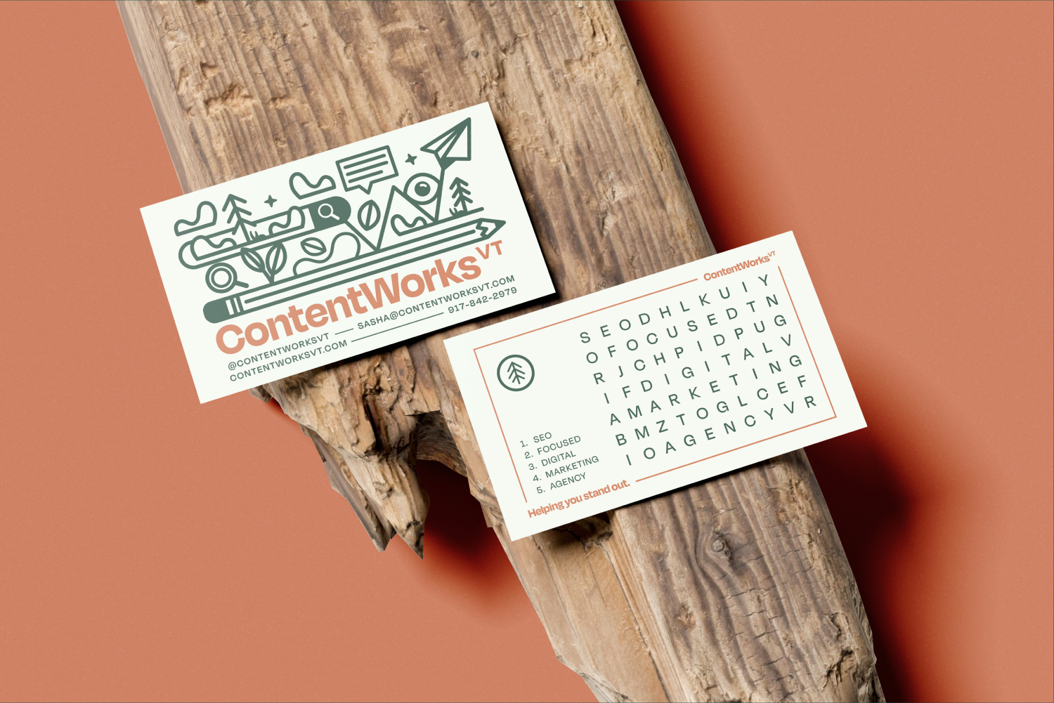
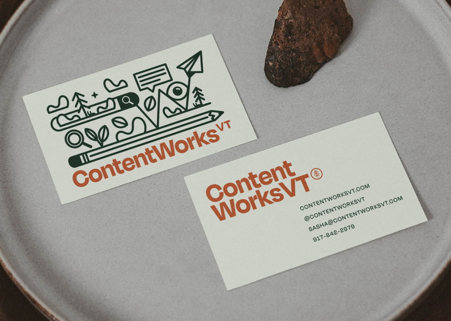
One of the most pivotal moments in the project came during concept development when the idea emerged to create two separate business card systems rather than forcing everything into one solution.

The first card remained clean and professional for traditional networking settings, while the second became a more experimental and interactive “word search” business card featuring hidden brand messaging and SEO-related terms. The concept transformed the business card from a simple informational tool into a tactile experience that encouraged interaction, curiosity, and conversation.

The project expanded beyond print collateral into a flexible illustration system that could be repurposed across social media, LinkedIn headers, website graphics, and future digital applications. Typography choices focused on balancing professionalism with accessibility. Carefully selected Google Fonts ensured the system remained web-safe and scalable across digital touchpoints while still feeling aligned with the brand’s warm and personality-driven tone. The custom illustrations and icons became a central part of the visual identity, helping unify the system while adding vibrancy and differentiation throughout the brand experience.

The final system helped ContentWorks VT establish a more memorable and approachable presence within the SEO and content marketing industry while creating touchpoints that encouraged genuine interaction and connection. The interactive word search business card became one of the strongest and most distinctive aspects of the project, helping the brand stand apart at conferences and networking events by turning a traditionally static object into something engaging and conversation-starting. More broadly, the project reinforced the idea that brands in highly technical industries do not need to sacrifice personality in order to be taken seriously. By blending playful interaction with thoughtful strategy, the final identity system created a balance between professionalism, expertise, and individuality.