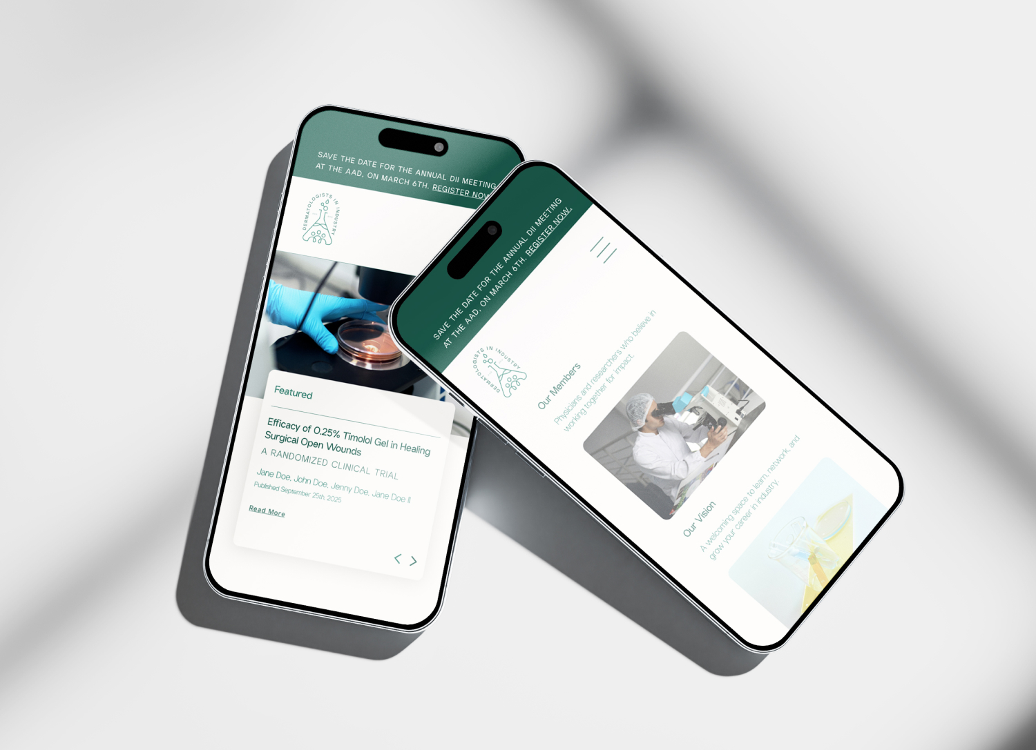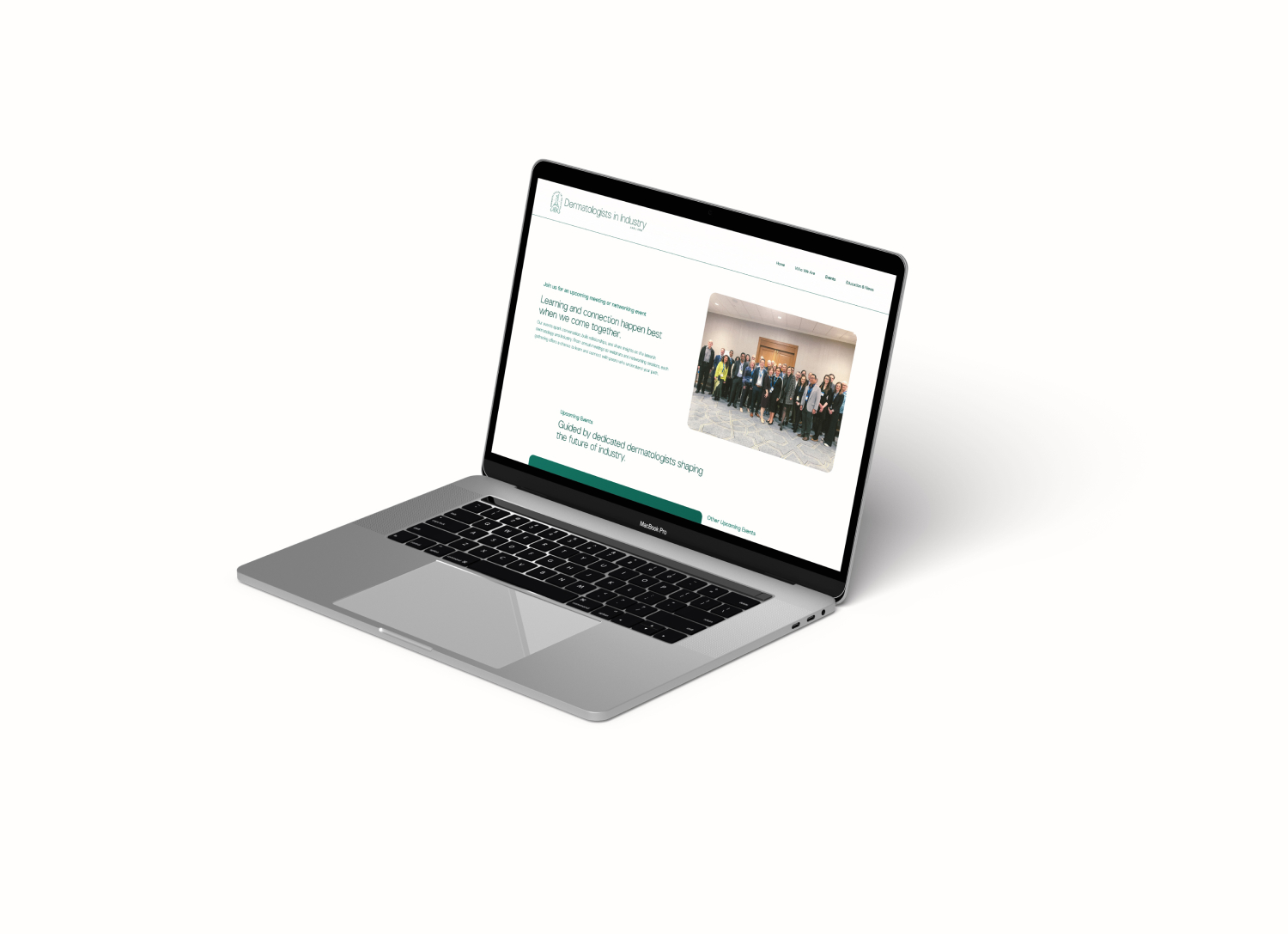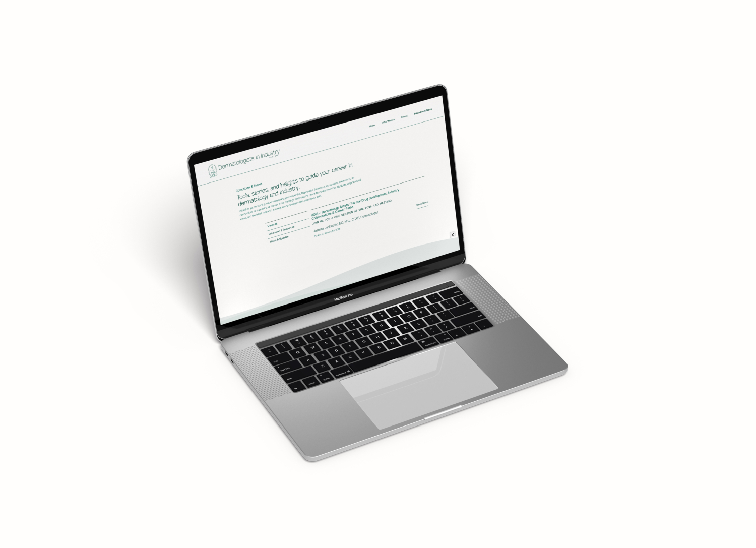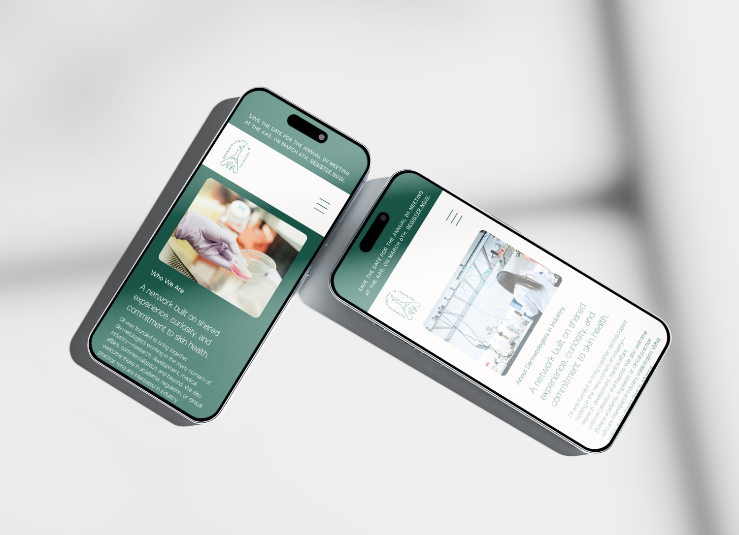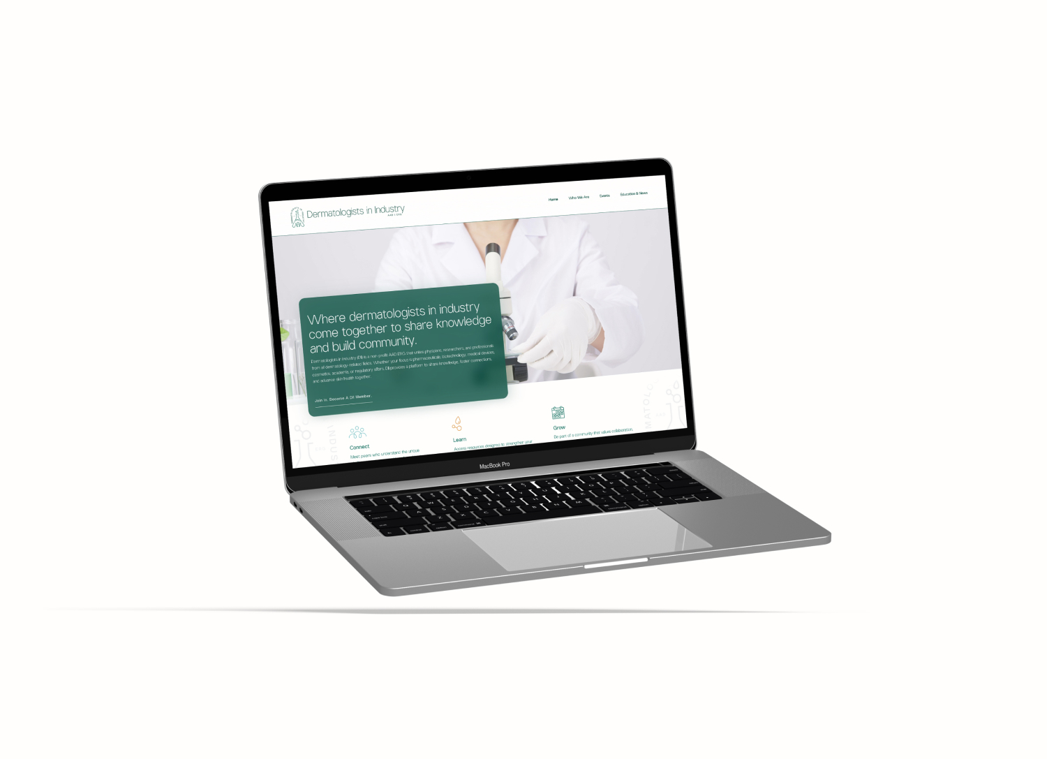
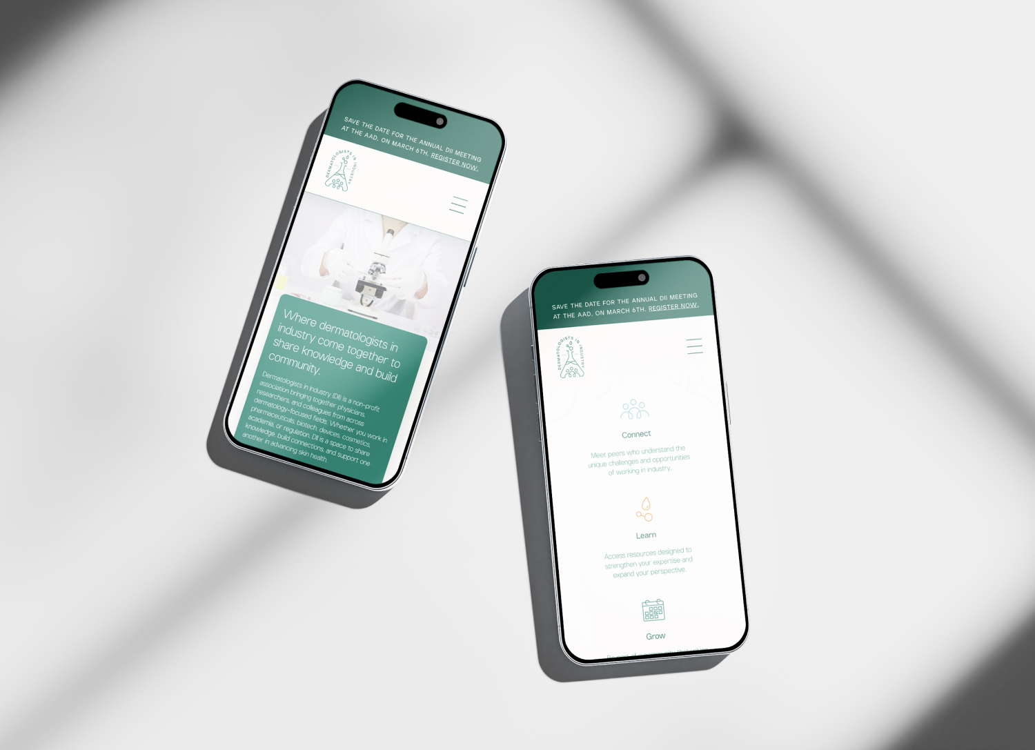
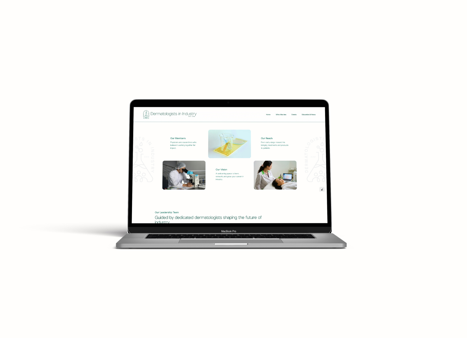
Dermatologists in Industry approached the project looking for a more cohesive and modern identity system that could better support the organization’s growing community and digital needs. Existing branding lacked consistency across platforms and applications, making it difficult to implement effectively across event tools, communications, and web experiences.
At the same time, the organization needed a new website infrastructure capable of housing scientific resources, event information, and member-focused content in a way that felt intuitive and easy to manage internally.
The challenge became creating a system that felt informed and professional without leaning too heavily into the cold or overly clinical aesthetics often associated with healthcare organizations. The identity needed to support credibility within the medical and scientific space while still feeling approachable and community-driven.
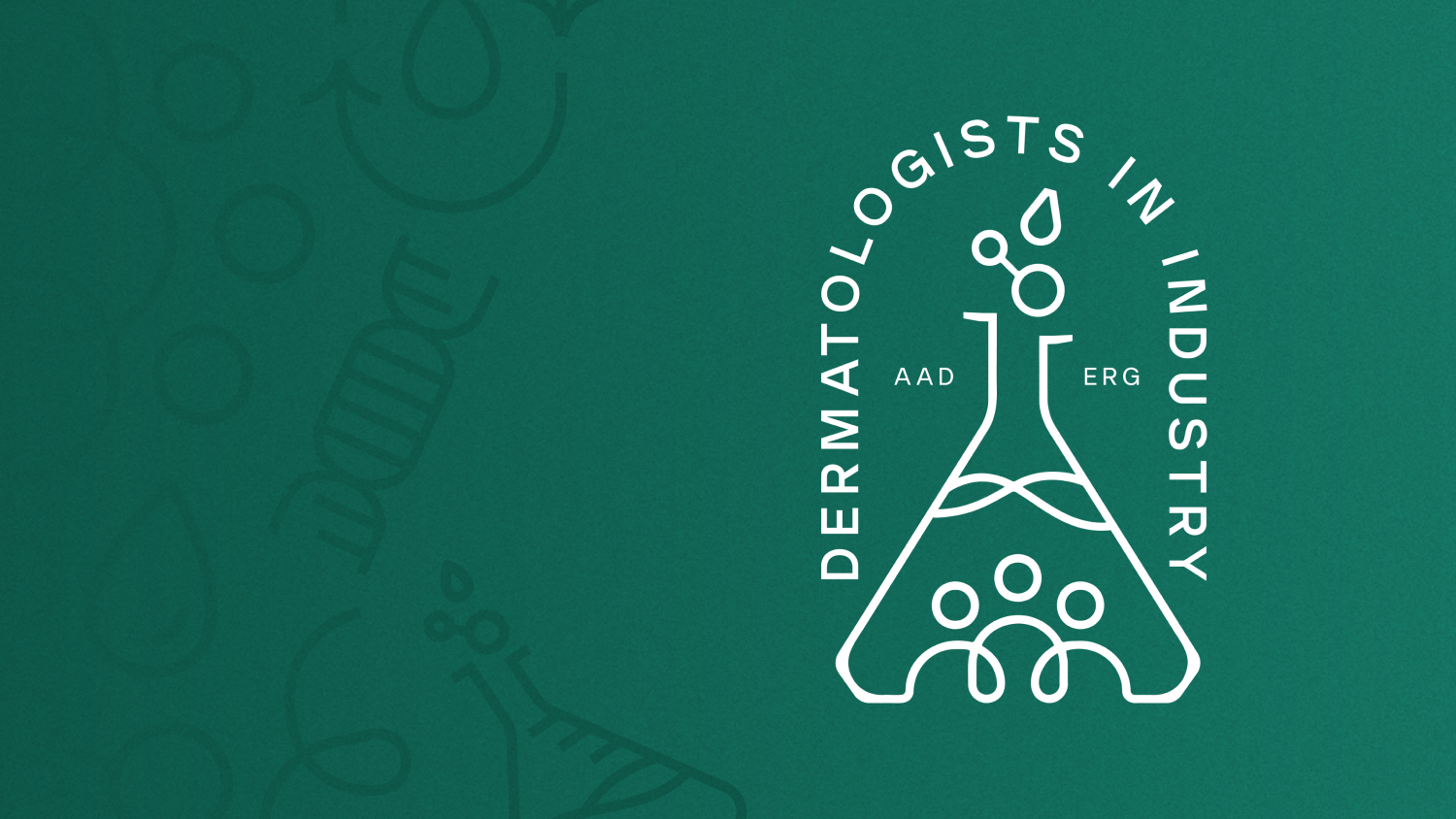
The visual direction focused on creating a clean, structured identity system inspired by sterile environments, modern interfaces, and simplified geometric forms. Early explorations centered around minimal wordmarks and traditional medical symbols, but the process eventually shifted toward developing a more distinctive and recognizable brand mark that could function more effectively across sponsorships, conferences, and digital applications.
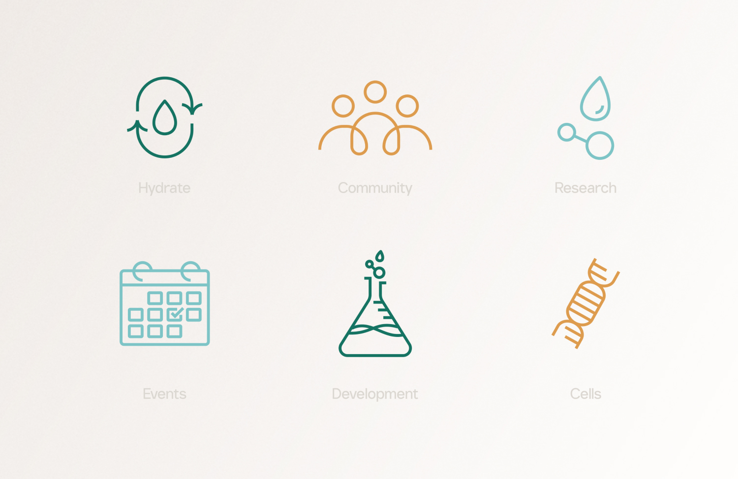
The final identity balances angular forms and minimal layouts with softer gradients, approachable typography, and custom iconography to create a system that feels both polished and welcoming.
Typography played an important role in shaping the tone of the brand. A clean sans-serif type system was selected to reinforce professionalism and clarity while still carrying enough personality to avoid feeling overly corporate or impersonal.