
Worldly, Playful, Fair Trade Coffee

Philly Fair Trade Roasters

Creative Direction
Brand Identity
Packaging
Illustration
Icon System
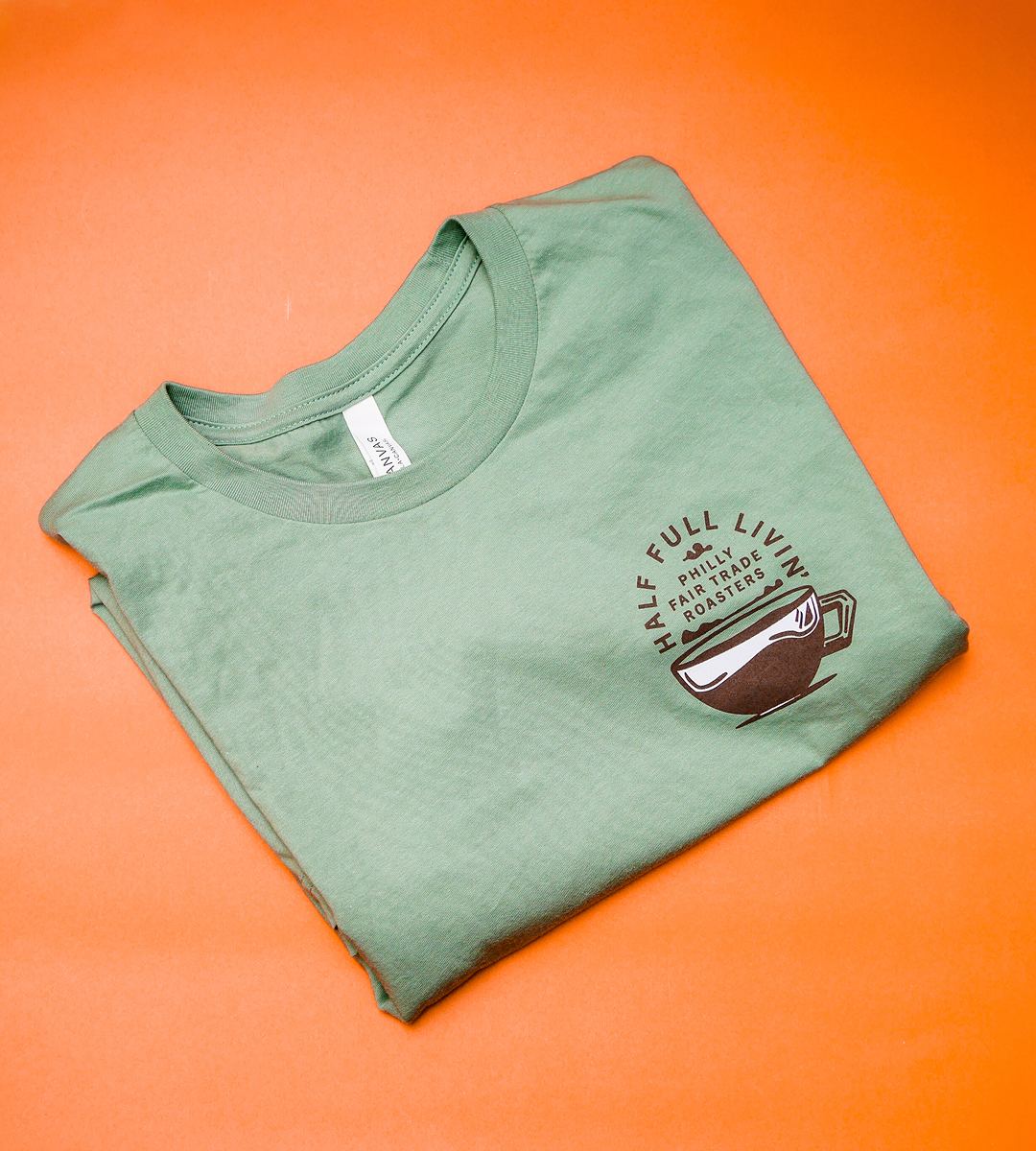
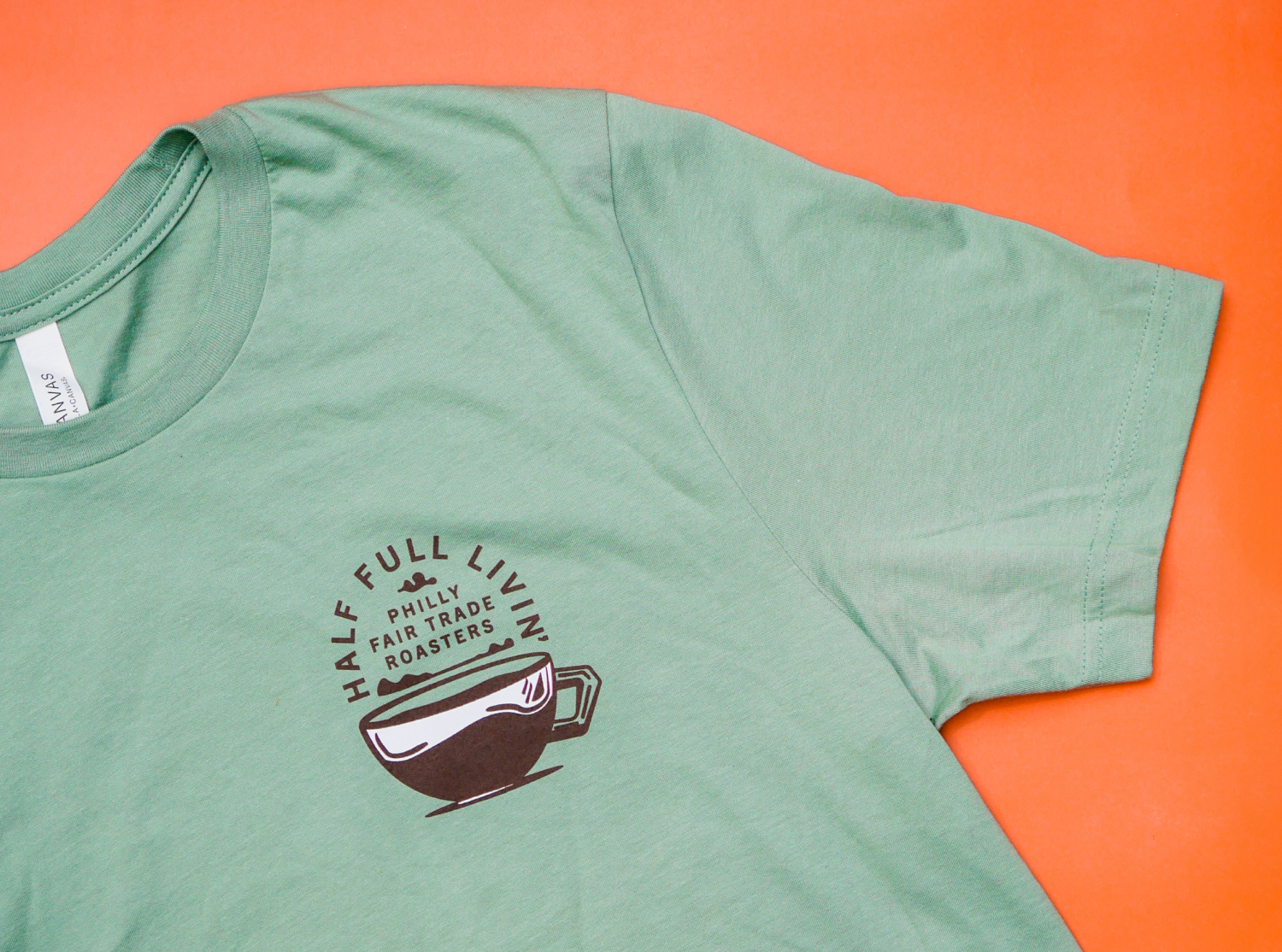
Merch Design
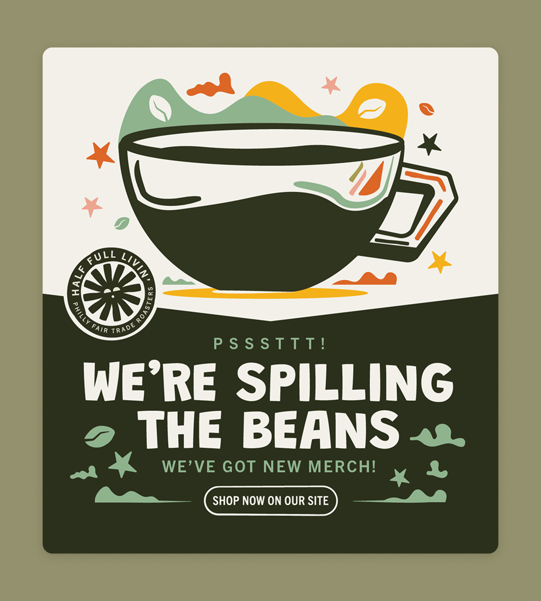
Social Media Templates
A vibrant rebrand inspired by the people, places, and stories behind every cup.

Pennsylvania-based coffee company specializing in small-batch organic and fair trade coffee sourced from cooperatives across the globe.

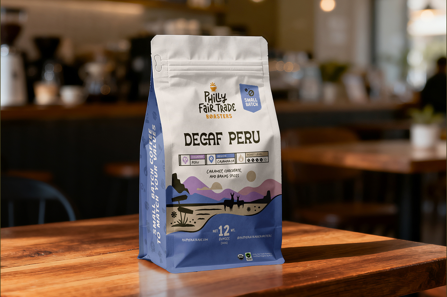
Created following a transition in ownership, the refreshed identity for Philly Fair Trade Roasters blends playful illustration, travel-inspired graphics, and a scalable packaging system designed to grow across retail, wholesale, and market experiences. Inspired by the diverse regions where the coffee is sourced, the visual identity captures a sense of discovery and warmth while helping the brand stand apart on crowded grocery shelves.

Philly Fair Trade Roasters approached the project during a period of transition as new ownership stepped in to evolve the brand while still respecting its history and long-standing commitment to fair trade coffee sourcing.

The previous identity had built recognition locally, but the system lacked the flexibility and personality needed for future growth. Packaging felt visually limited, and there was an opportunity to better highlight the global origins and stories behind the coffee itself. The goal became creating a scalable identity system that felt bright, welcoming, and distinctive across packaging, social media, retail environments, and market experiences.

At the same time, the brand needed to avoid blending into the increasingly crowded landscape of minimalist and overly artisanal coffee packaging.

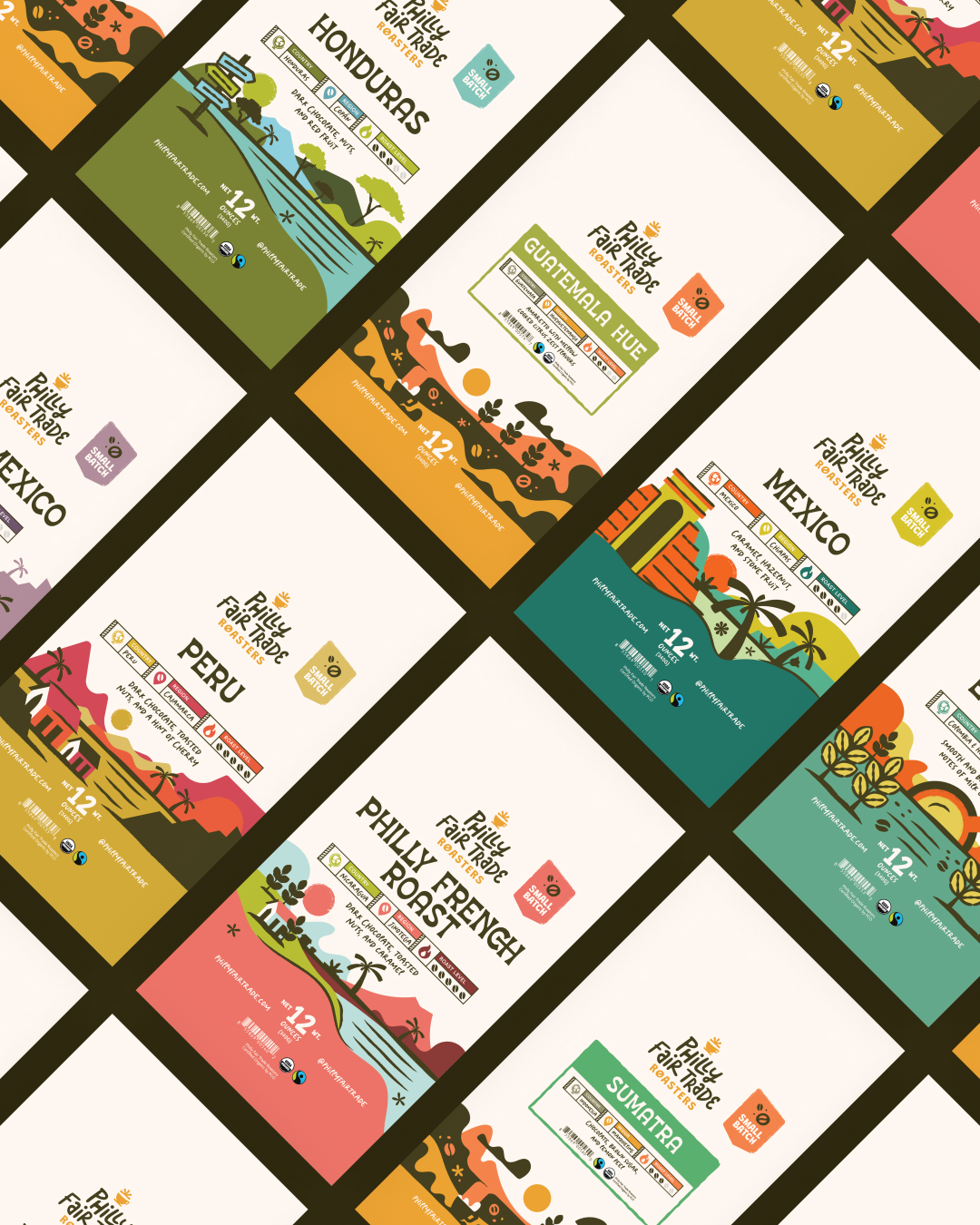
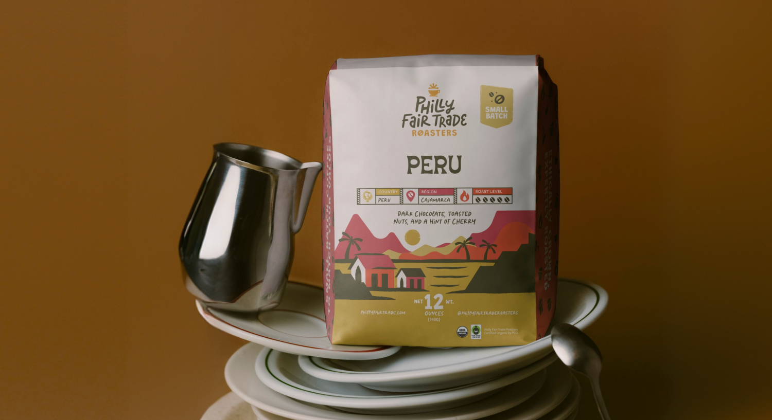
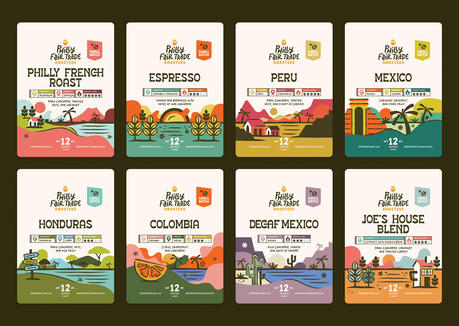
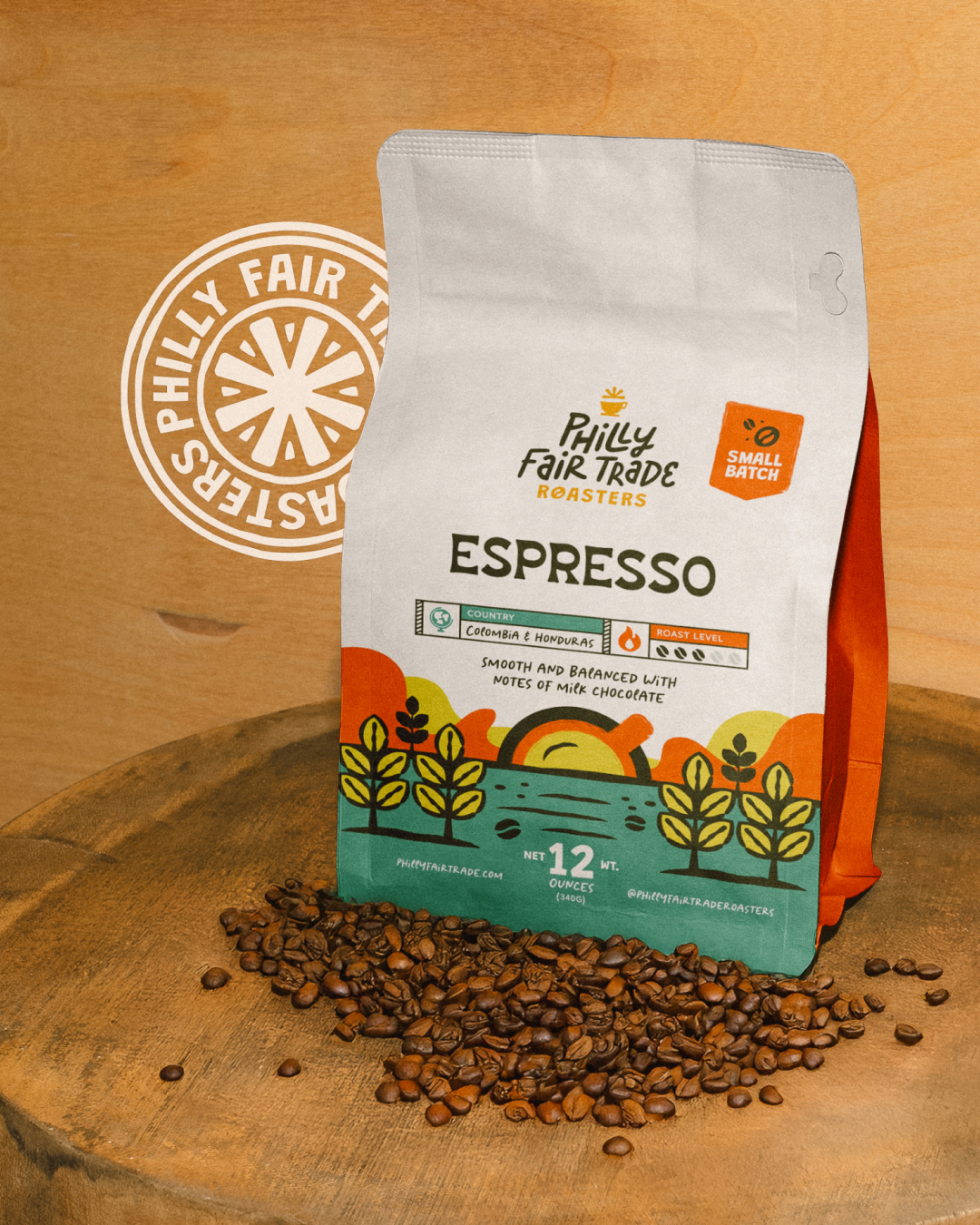
The creative direction was heavily inspired by travel ephemera, vintage postcards, passport stamps, and the countries where the coffees are sourced. Each packaging illustration was designed to reflect recognizable environmental, architectural, and cultural elements tied to the coffee’s origin while still functioning cohesively as part of a larger system.

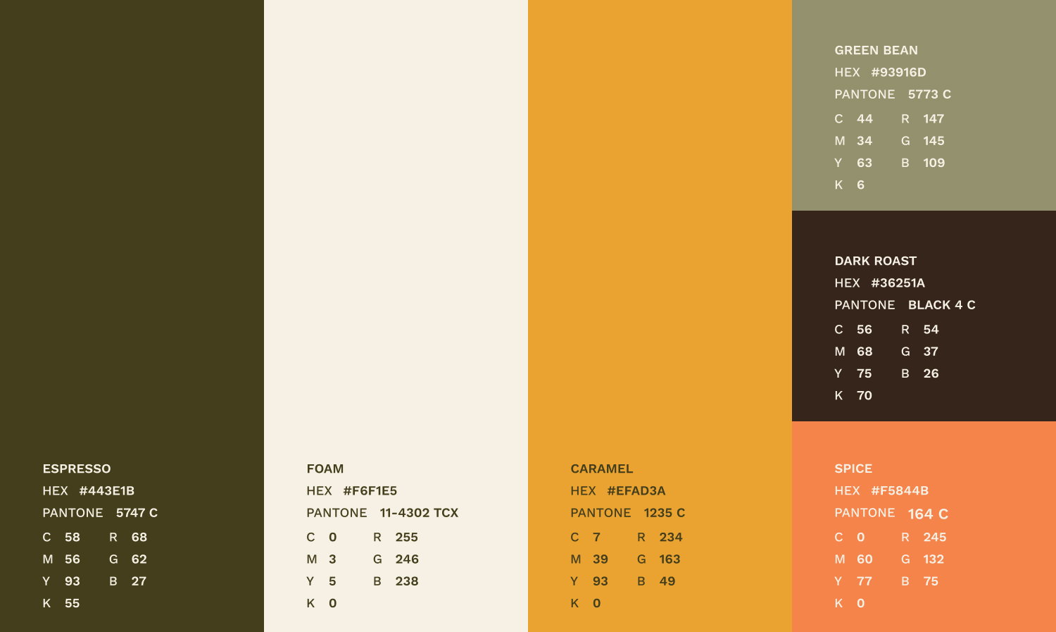
The identity balances playful illustration with a clean, flexible structure that allows the packaging to feel expressive without becoming overwhelming. Bright jewel tones and saturated natural colors were used throughout the system to create energy and visibility on shelves while reinforcing the sunny, welcoming personality of the brand.

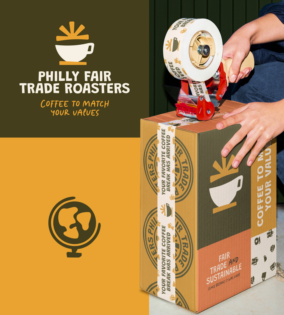
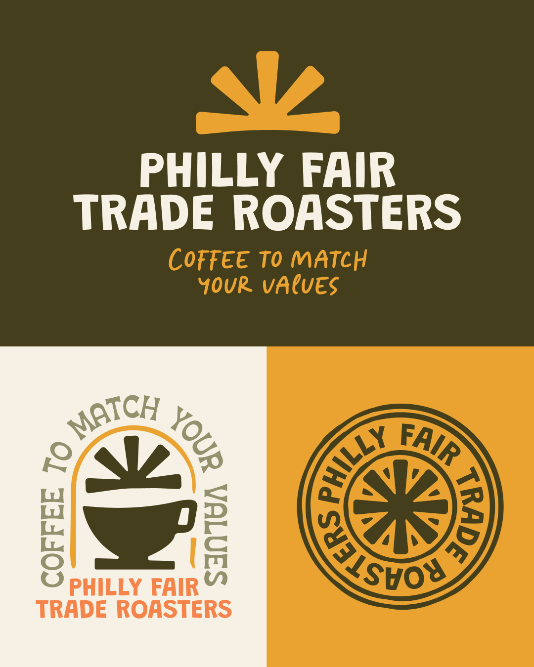
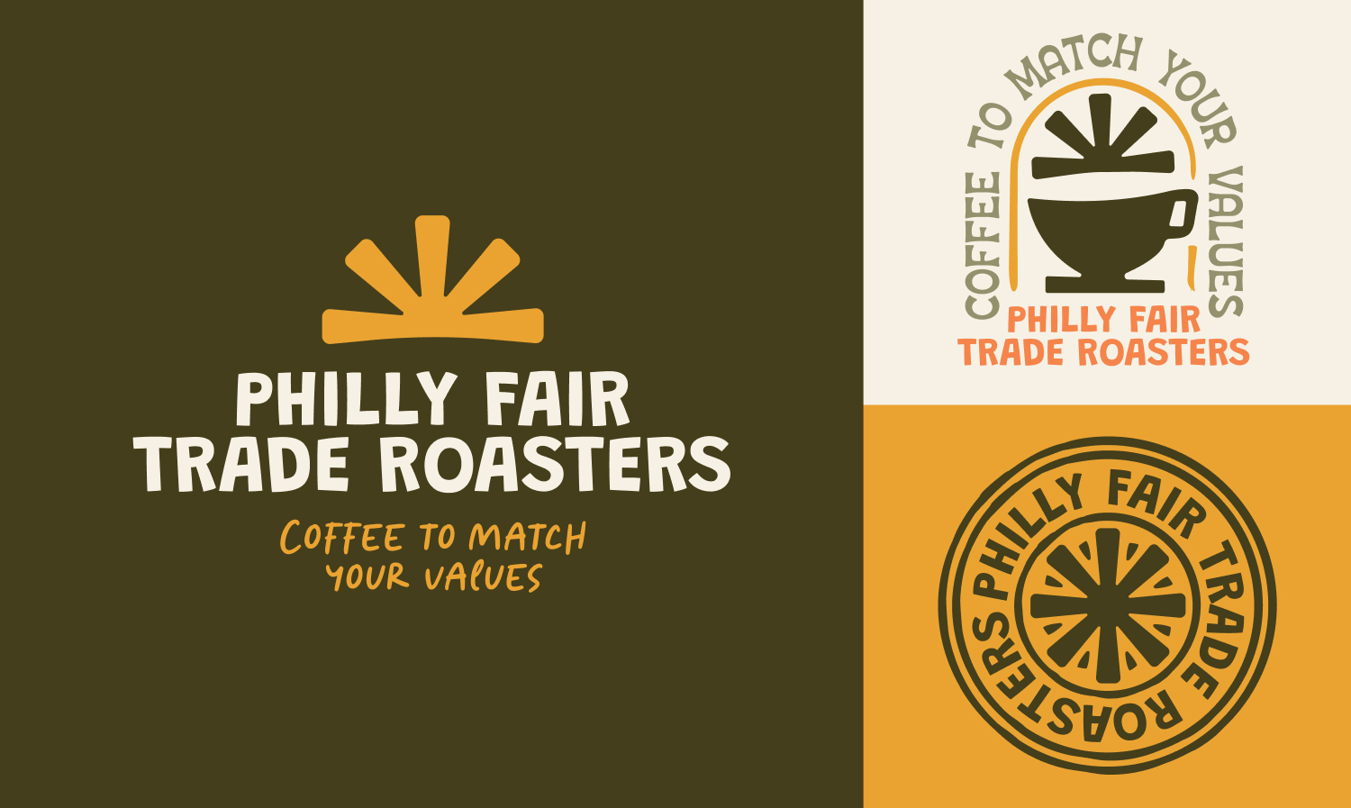
To preserve continuity with the company’s legacy, a heritage-inspired logo mark was developed that referenced elements from the original branding, including the leaf forms tied to the company’s organic and fair trade mission. Alongside the legacy mark, a fully responsive logo suite was created to support future growth across digital and physical applications.
Working with Sophia has been a very positive experience.

She's professional, yet personable, flexible and follows through on the timelines she provides. Projects she has done for us include t-shirt design, ad design and creation, coffee label design, product pictures and design work for flyers/posters. I have recommended Sophia to others and continue to do so.

Cordell Martin

Owner, Philly Fair Trade Roasters

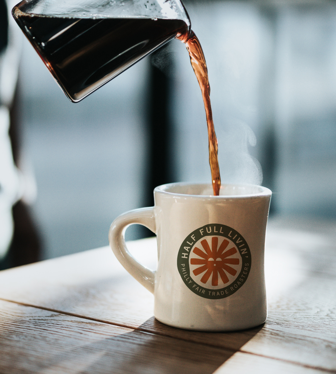
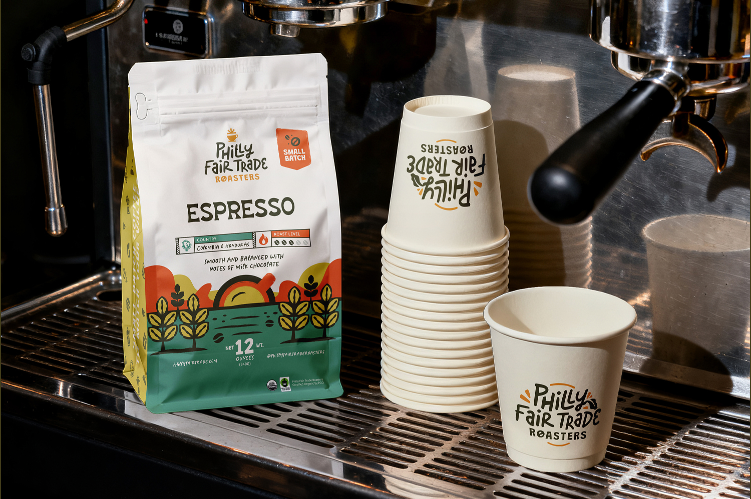
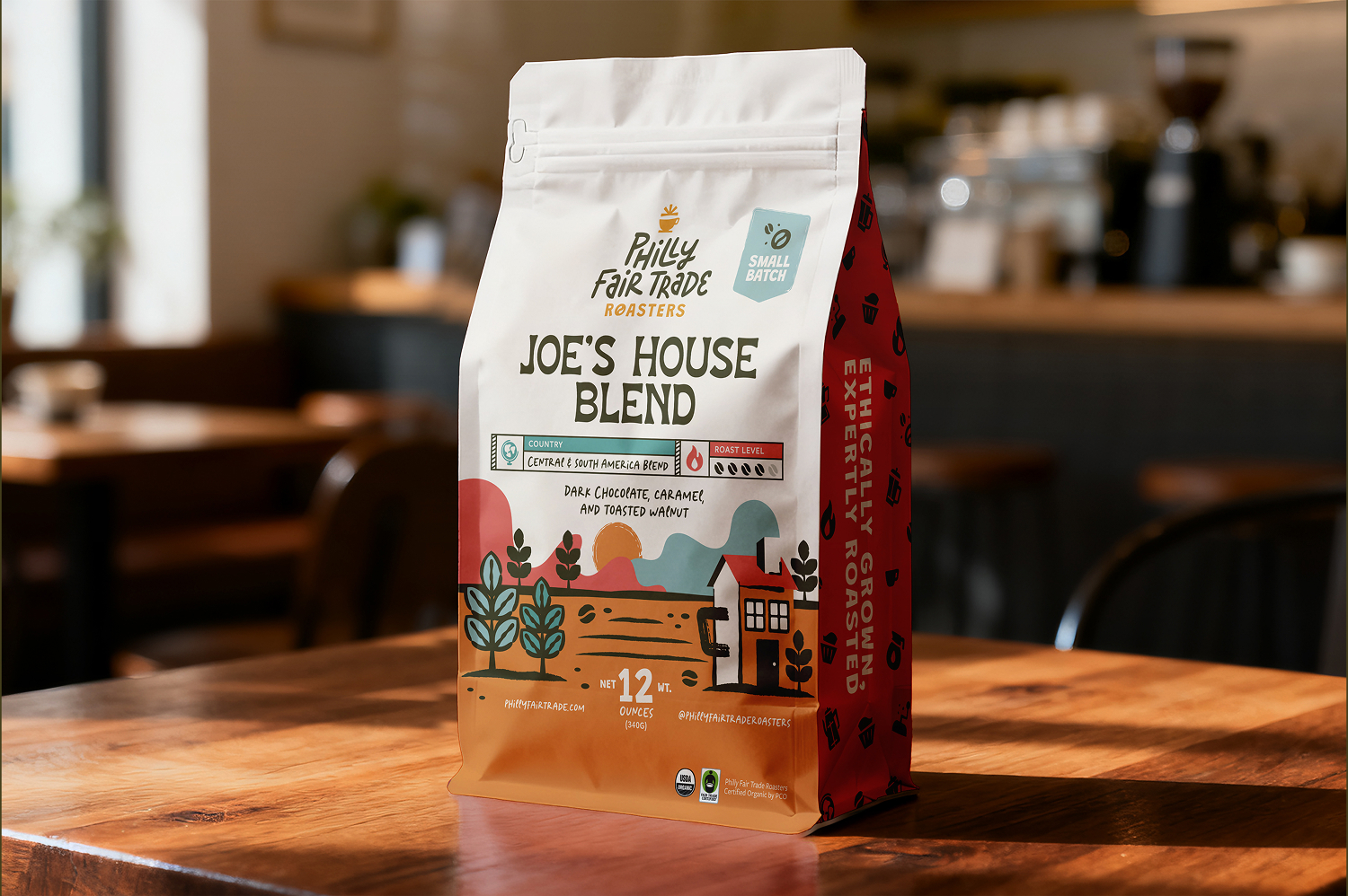
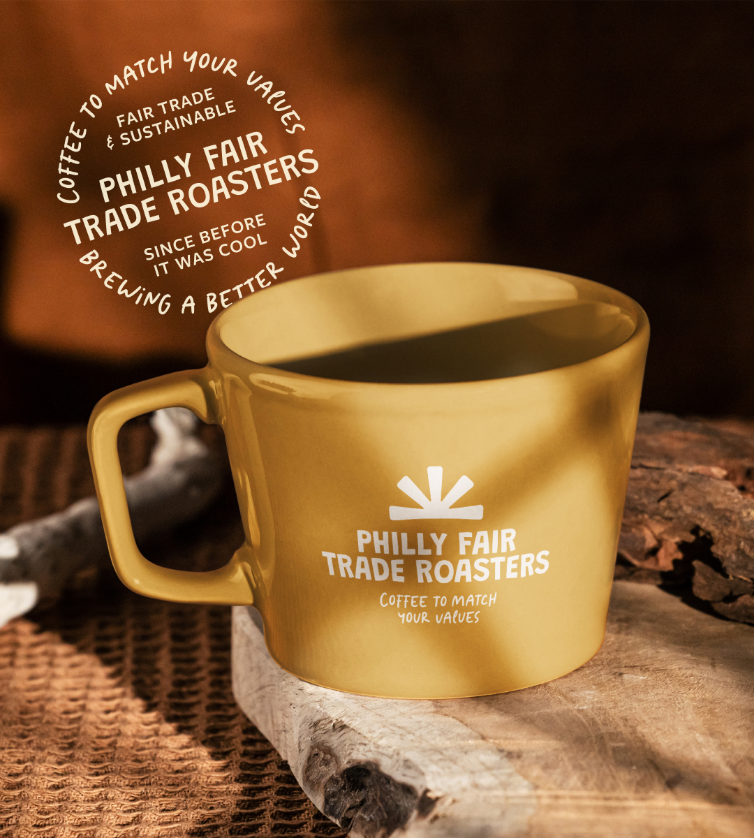
The visual system was designed to remain highly adaptable across many touchpoints, from coffee bags and market signage to social templates, icon systems, merchandise, and future packaging extensions.

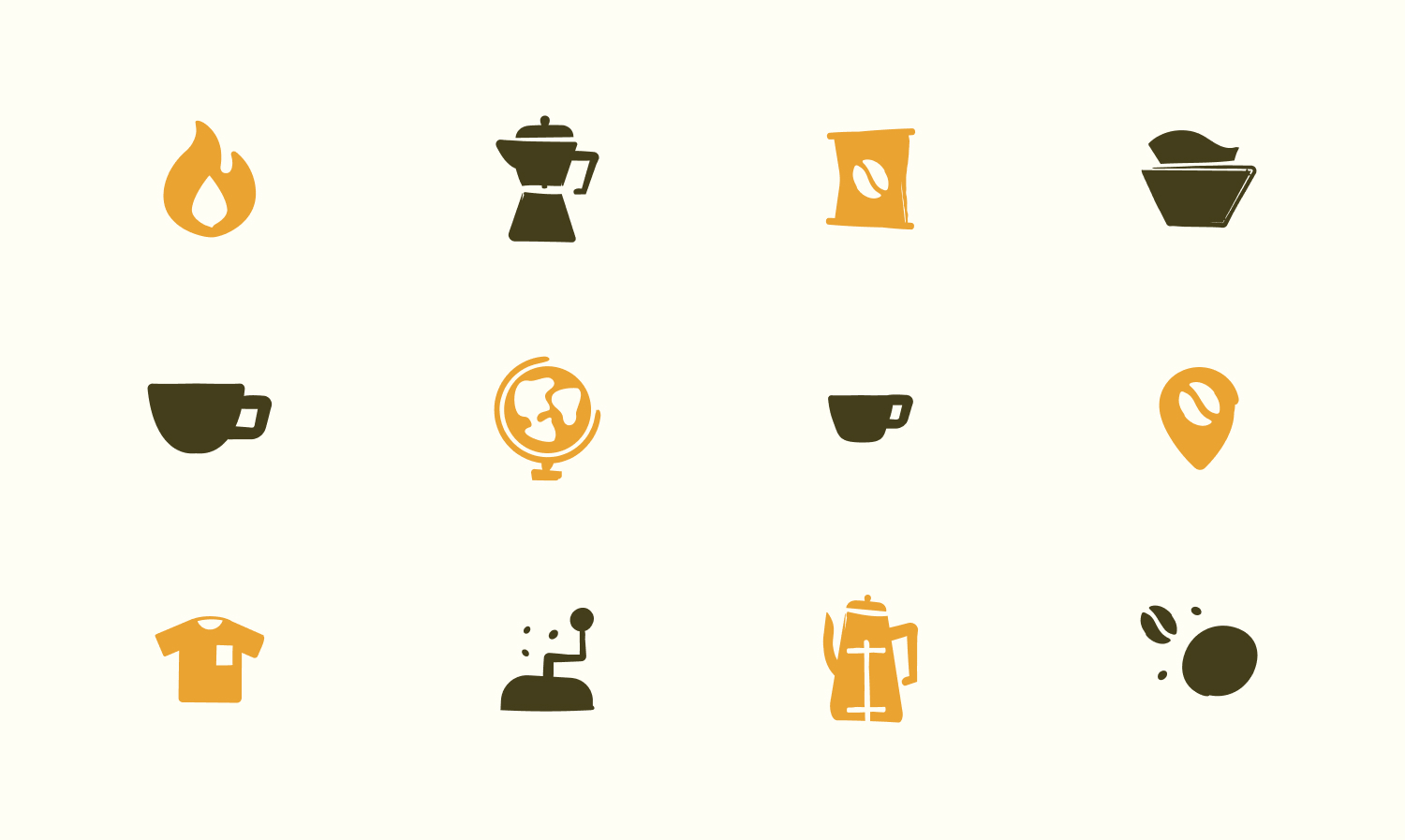
Handwritten-inspired typography helped reinforce the travel postcard aesthetic while bringing warmth and personality into the brand. Supporting iconography and pattern systems created additional flexibility across packaging and promotional materials, allowing the brand to feel cohesive while still celebrating the individuality of each coffee origin.

A major focus throughout the project was finding balance between simplicity and personality. The system needed enough structure to scale efficiently while still feeling handcrafted, expressive, and unique to the brand.

Following the rebrand, Philly Fair Trade Roasters continued expanding into larger retailers and local grocery chains, including placements in stores like Whole Foods. The refreshed identity helped create a stronger shelf presence while giving the company a more recognizable and scalable visual system for continued growth.

One of the most successful aspects of the project was the packaging illustration system, which brought individuality and storytelling into each coffee while still feeling unified across the product line. The combination of playful illustration, travel-inspired graphics, and flexible branding helped position the company as both approachable and quality-driven within the specialty coffee space.