Coastal Nostalgia, Community-Driven Skate Culture

Coureur Goods

Creative Direction
Illustration
Secondary Marks
Postcard-inspired merch release celebrating the energy of Portsmouth, New Hampshire through skate culture, local landmarks, and community connection.

Designed for local events and summer releases, this illustration suite combined vintage postcard influences with vibrant skate energy to create merchandise that felt both tourist-friendly and authentically local.

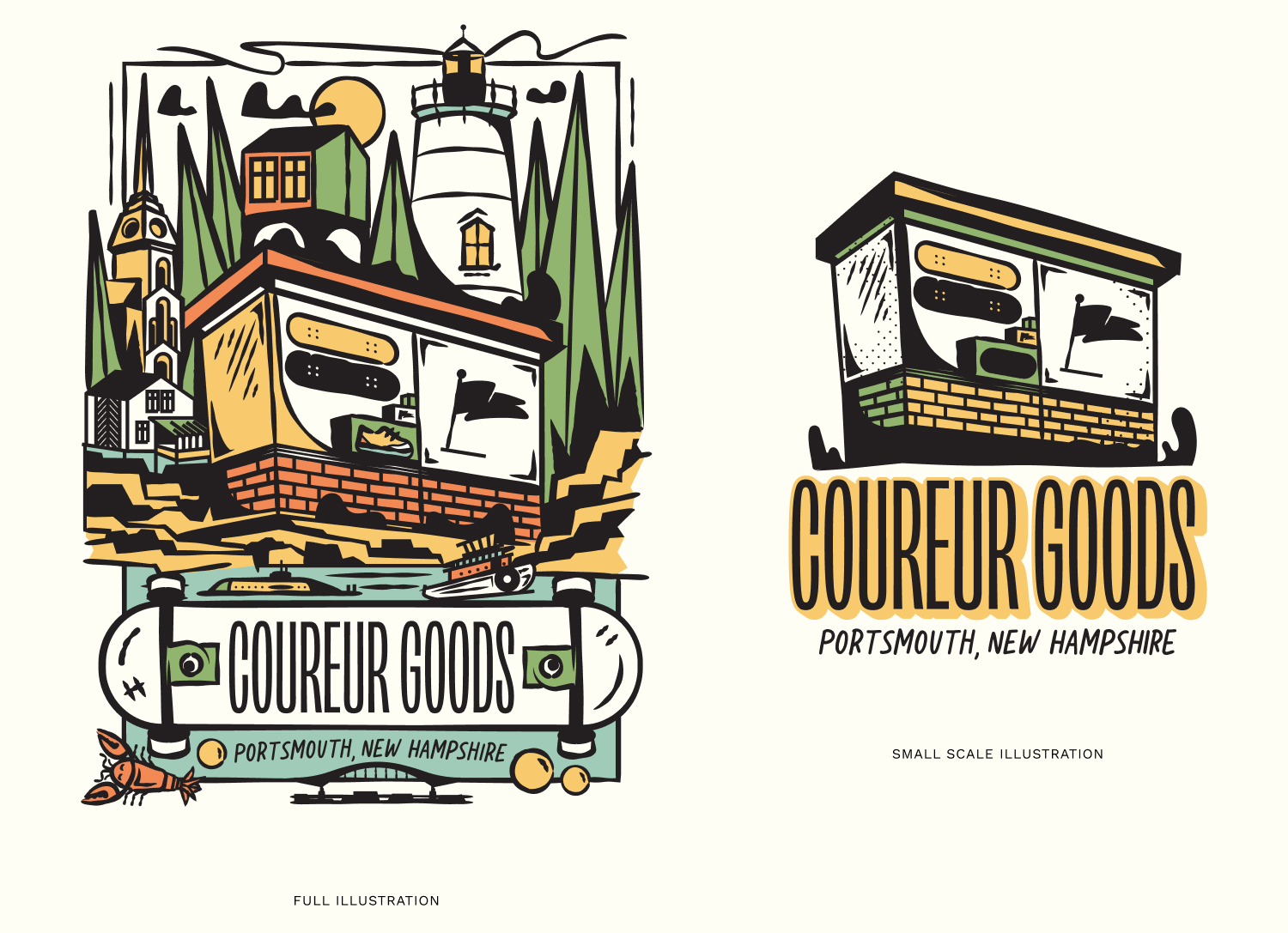
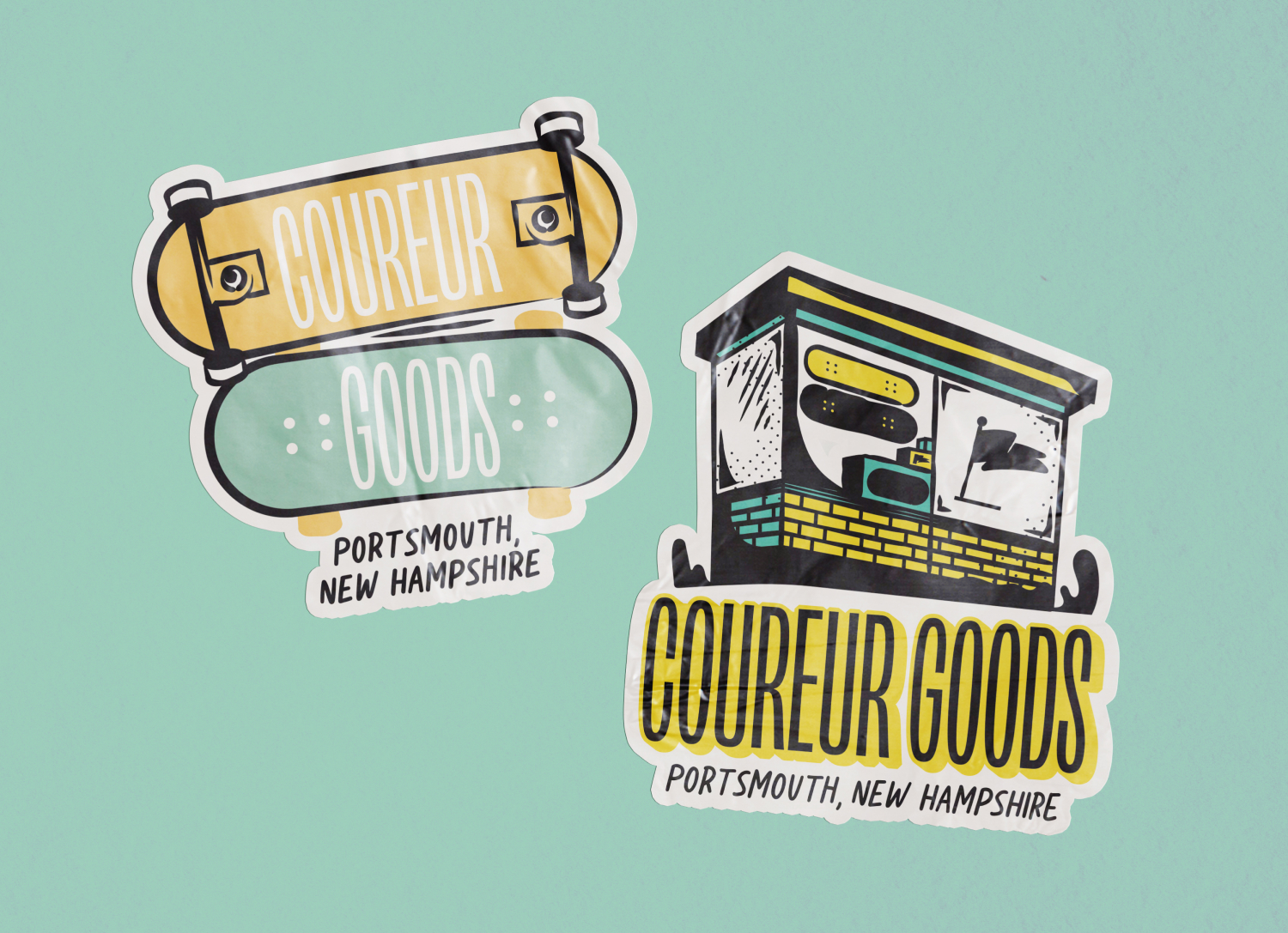
Coureur Goods wanted to create a merchandise release that celebrated Portsmouth, New Hampshire while staying rooted in the culture of the local skate community. Inspired by vintage postcards and coastal summer nostalgia, the project centered around a large-scale illustrated composition featuring the skateshop alongside recognizable local landmarks, supported by a system of secondary marks for shirts, stickers, prints, and event merchandise.

Coureur Goods is deeply connected to the Portsmouth community, so the goal of this release was to create something that felt recognizable to locals while still appealing to visitors exploring the city’s skate and surf culture. The project was inspired by vintage travel postcards, local landmarks, and the laid-back energy of New Hampshire summers.

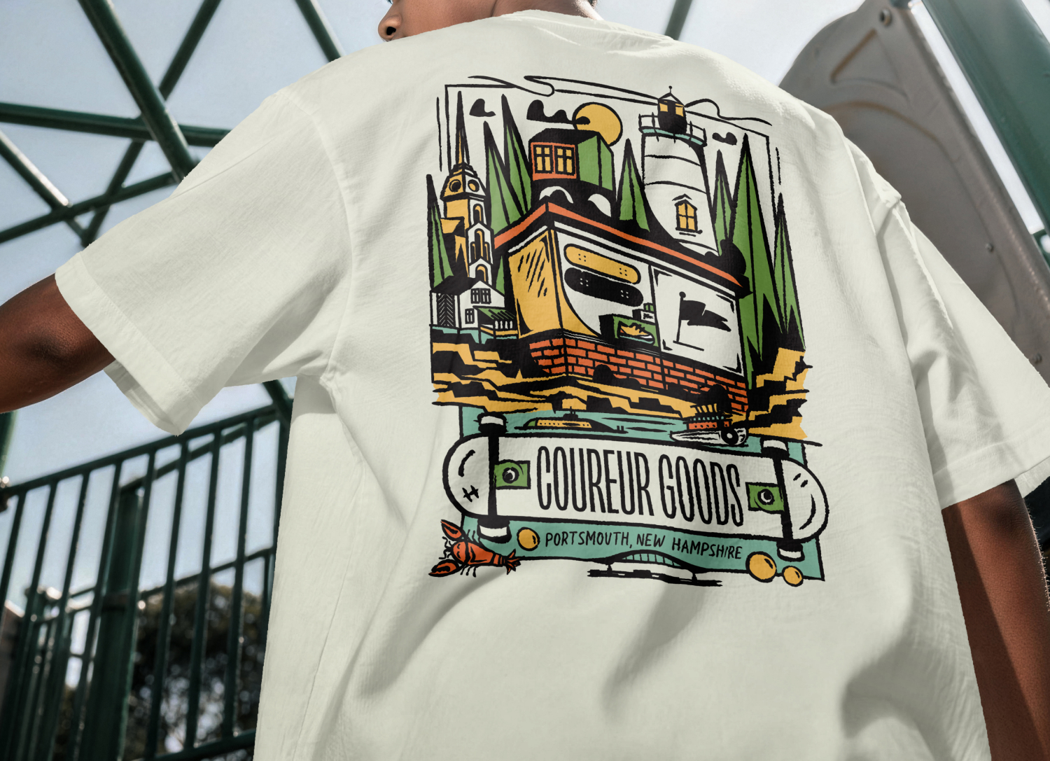
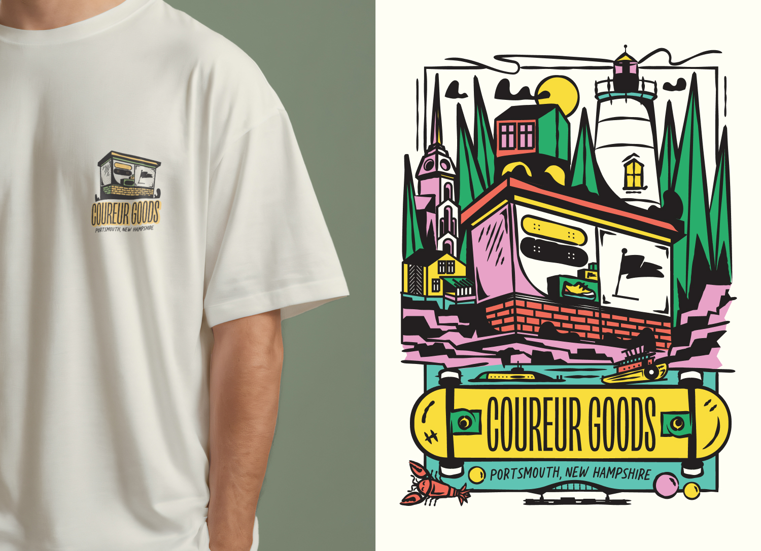
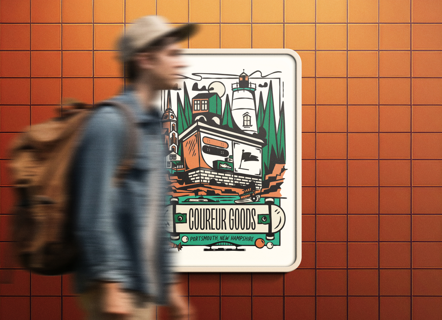
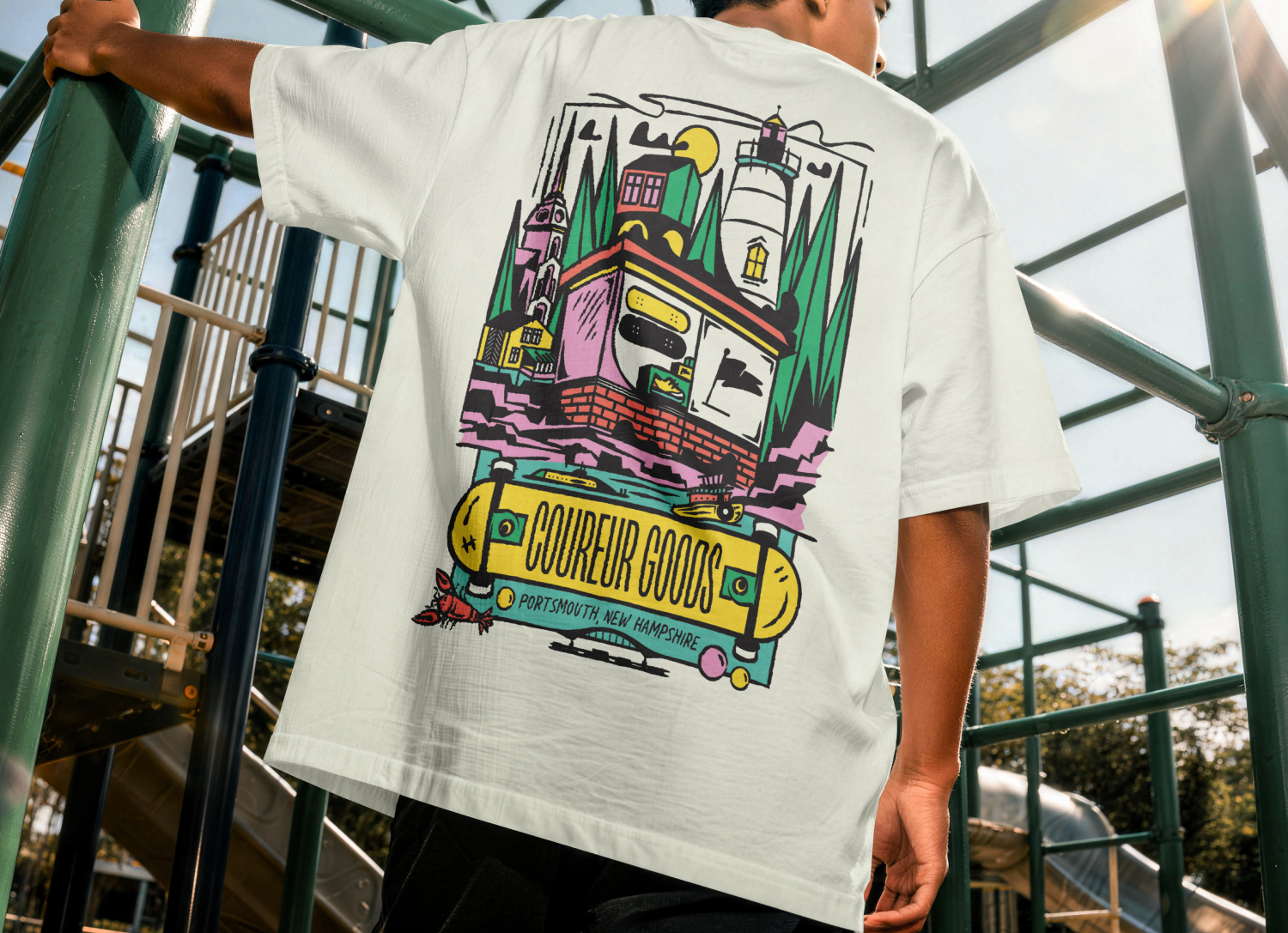
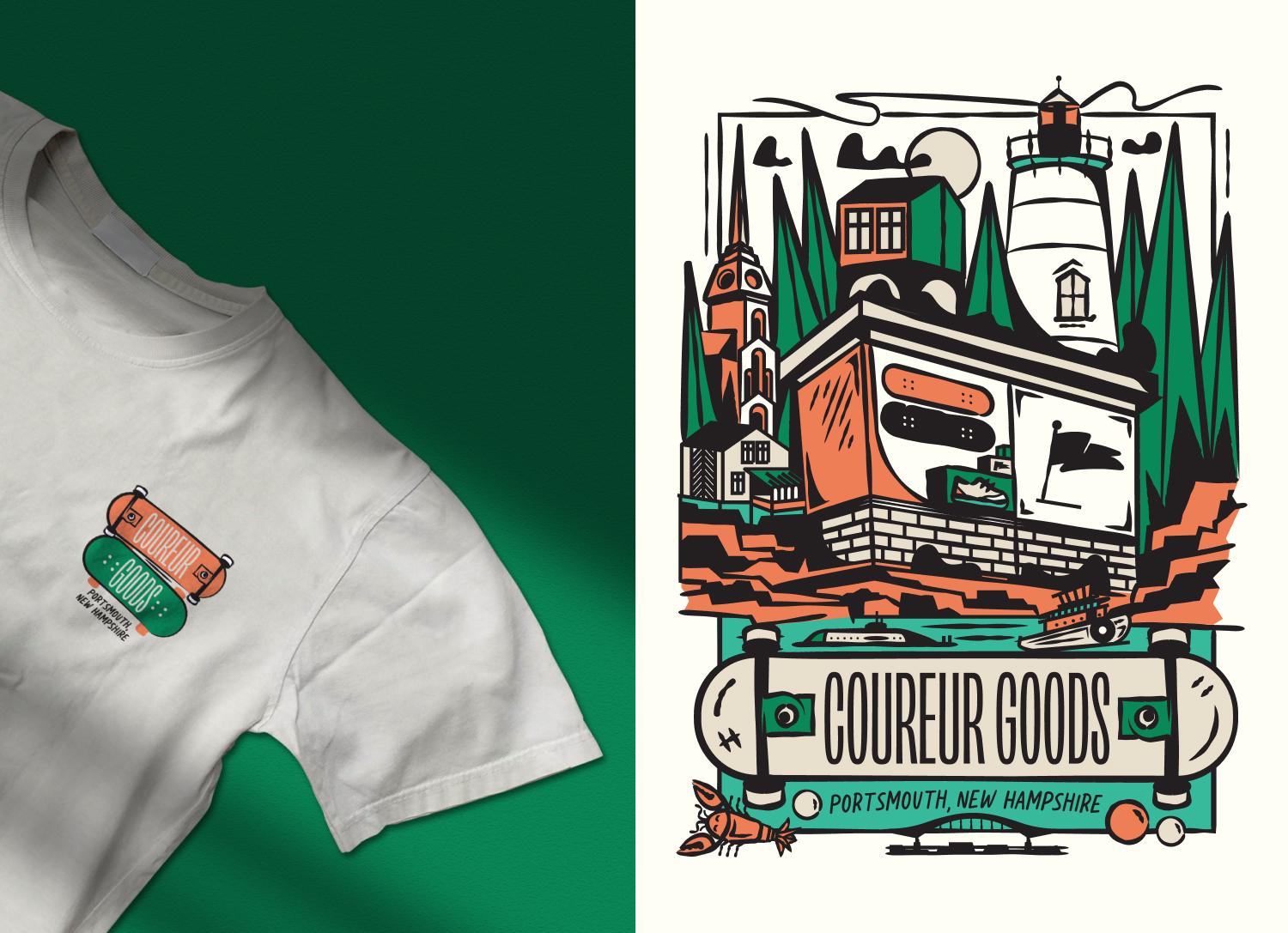
The final illustration suite centered around a detailed scene featuring the Coureur storefront surrounded by landmarks and environmental references pulled directly from Portsmouth — including the drawbridge, coastline, church architecture, beaches, skate culture, and maritime influences. The result was a design system that felt welcoming, community-focused, and distinctly tied to place.

The visual direction balanced nostalgic postcard aesthetics with a more modern skate-inspired approach. Typography paired condensed sans-serif lettering with handwritten elements to create a familiar “Greetings From” postcard feel while still feeling youthful and contemporary.

Color palettes explored several directions ranging from muted coastal earth tones to brighter neon-inspired variations that leaned more heavily into skate and surf culture. Limited color palettes were intentionally developed so the artwork could translate effectively into screenprinted merchandise while still feeling vibrant and expressive.
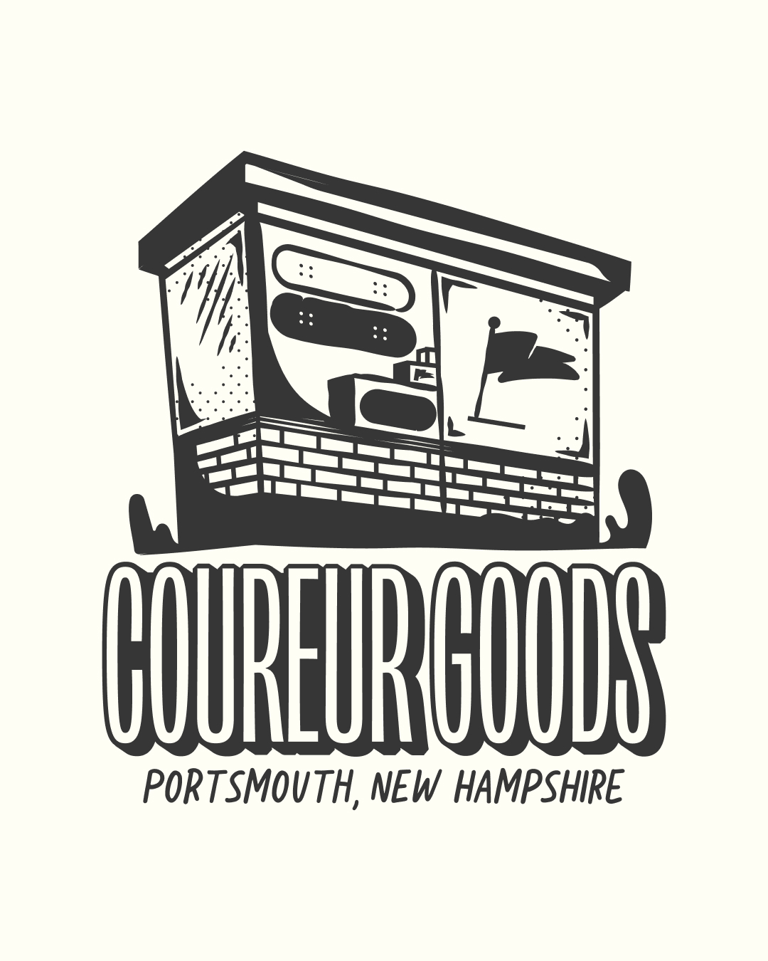
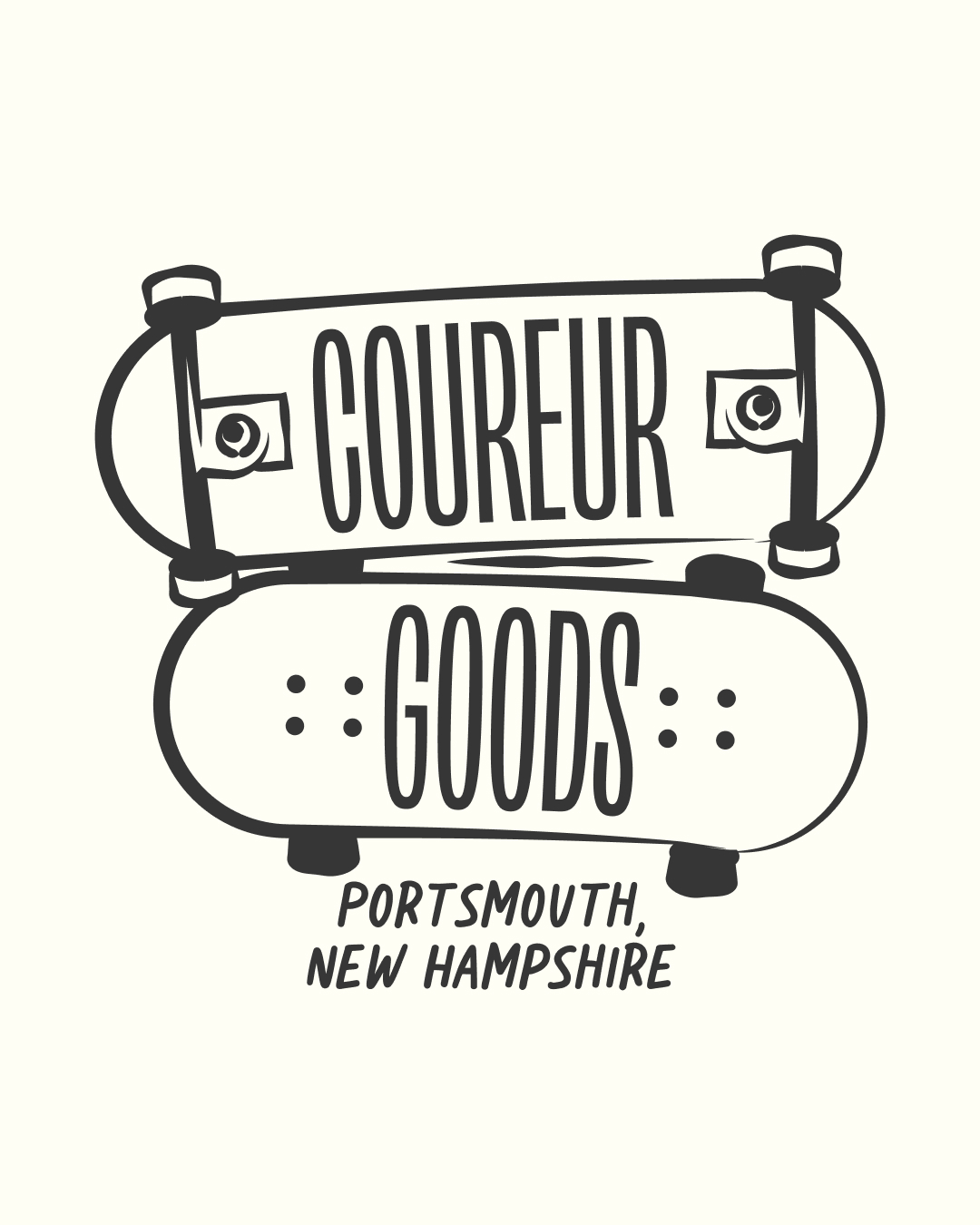
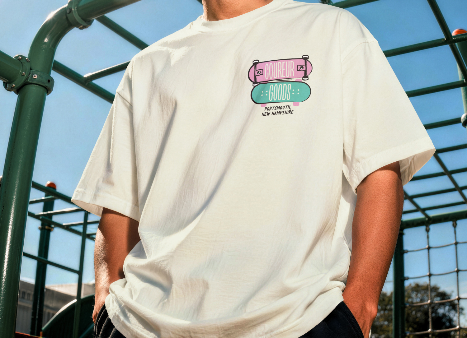
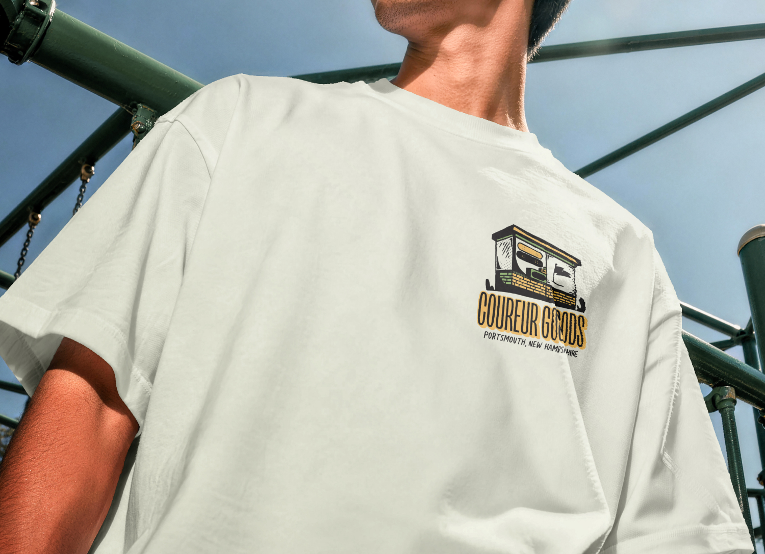
The primary illustration was designed for large-scale applications like back graphics on t-shirts and poster prints, while a set of secondary marks expanded the system across smaller touchpoints like front pocket graphics, stickers, and postcards. This flexibility allowed the release to feel cohesive across multiple products while giving the brand room to experiment with different garment colorways and merchandise formats.

The project also had a relatively quick turnaround in order to launch alongside local community events, which shaped the design process and encouraged a streamlined, highly collaborative workflow.

One of the most rewarding parts of the project was seeing how strongly the designs resonated with the local community. The shirts sold out quickly during the initial release, reinforcing how meaningful locally-driven merchandise can be when it genuinely reflects the culture and identity of a place.

This project was a reminder that successful merch design often comes from creating emotional connections — not just graphics. By combining skate culture, local storytelling, and nostalgic illustration styles, the release became something that people wanted to wear because it represented their connection to Portsmouth and the community surrounding Coureur Goods.