Playful, Homegrown Plant Parenthood

Foliavert

Creative Direction
Brand Identity
Illustration
Icon System
Packaging
Typography
A vibrant plant brand designed to make collecting, caring for, and learning about plants feel approachable and fun.

Foliavert is a small-scale online plant retailer focused on curated plant sales, education, and creating a more welcoming experience for new and experienced plant owners alike.

The project centered around developing a playful and scalable visual identity that could support e-commerce, educational resources, packaging, and future brand growth. Created for a one-woman greenhouse and online plant shop, the Foliavert identity combines expressive typography, playful illustration, and an expansive educational icon system into a brand experience that feels personal, approachable, and distinctly different from larger corporate plant retailers. The result is a flexible visual system designed to grow alongside the brand while making plant care feel less intimidating and more engaging.

Foliavert was created as a reimagining of an existing small-scale plant business specializing in succulents, tropical plants, and cacti sold through Etsy and online storefronts. The goal of the rebrand was to move beyond a simple plant shop and create a more fully realized brand experience centered around both plant sales and plant education.

The challenge became developing an identity that could feel playful and approachable while still functioning effectively across packaging, educational materials, e-commerce applications, and future digital experiences.

Within the increasingly saturated online plant market, it was also important that the brand avoid falling into the same minimalist or trend-heavy aesthetics commonly used throughout the industry. Foliavert needed to feel distinctly personal, homegrown, and character-driven in comparison to larger-scale plant retailers.

The visual direction focused on building a playful and welcoming world around the brand while still allowing the plants themselves to remain central to the experience.

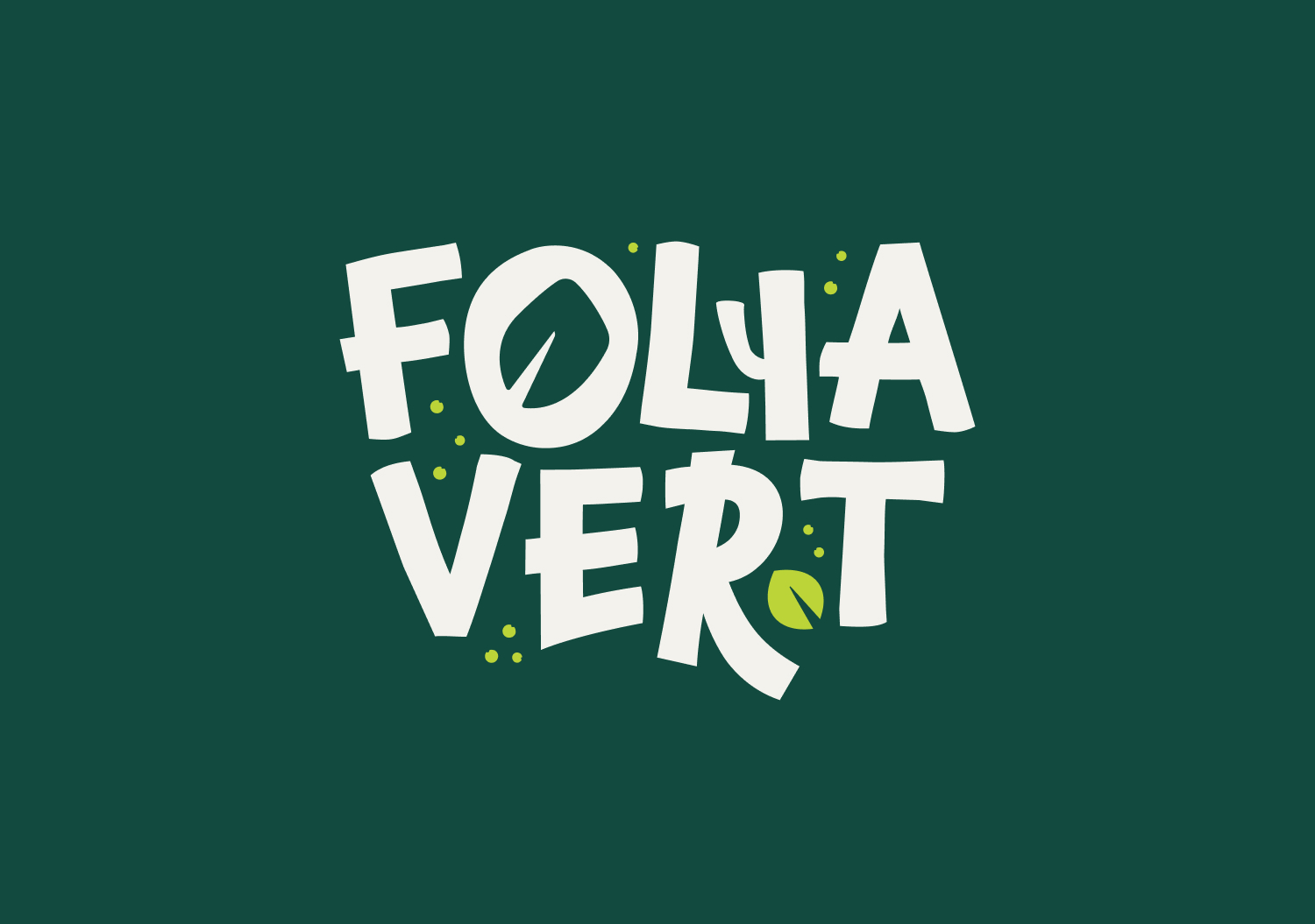
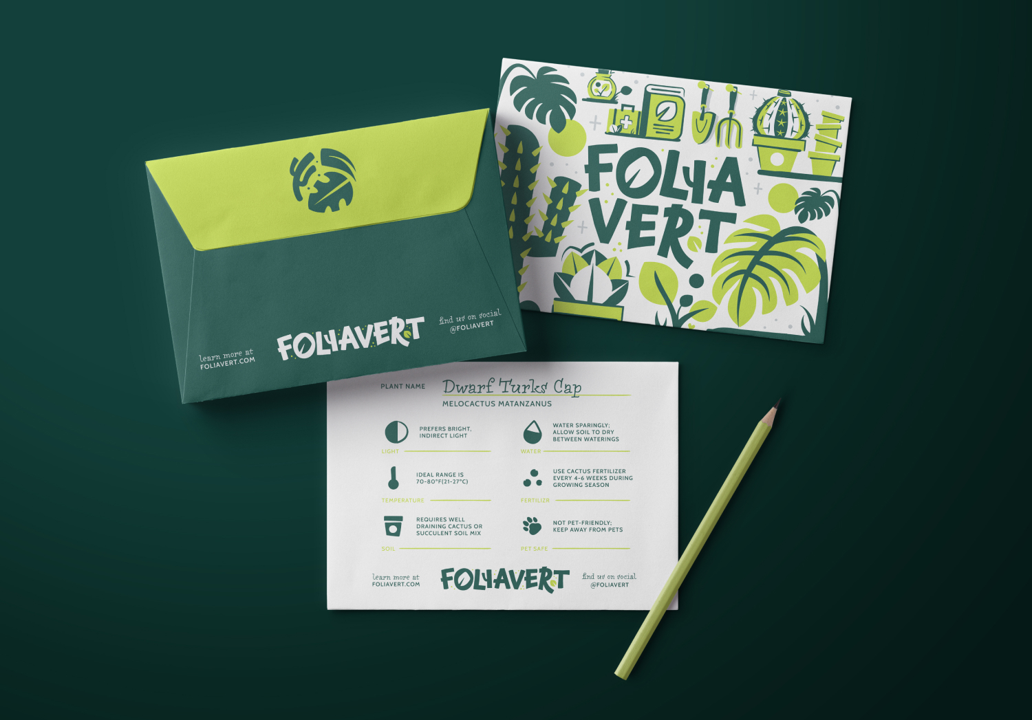
A custom wordmark became one of the defining elements of the identity, integrating subtle plant-inspired forms directly into the typography to create something recognizable and full of personality. Supporting typefaces with handwritten qualities helped reinforce the more personal and approachable tone of the brand while reflecting the small-scale nature of the business.

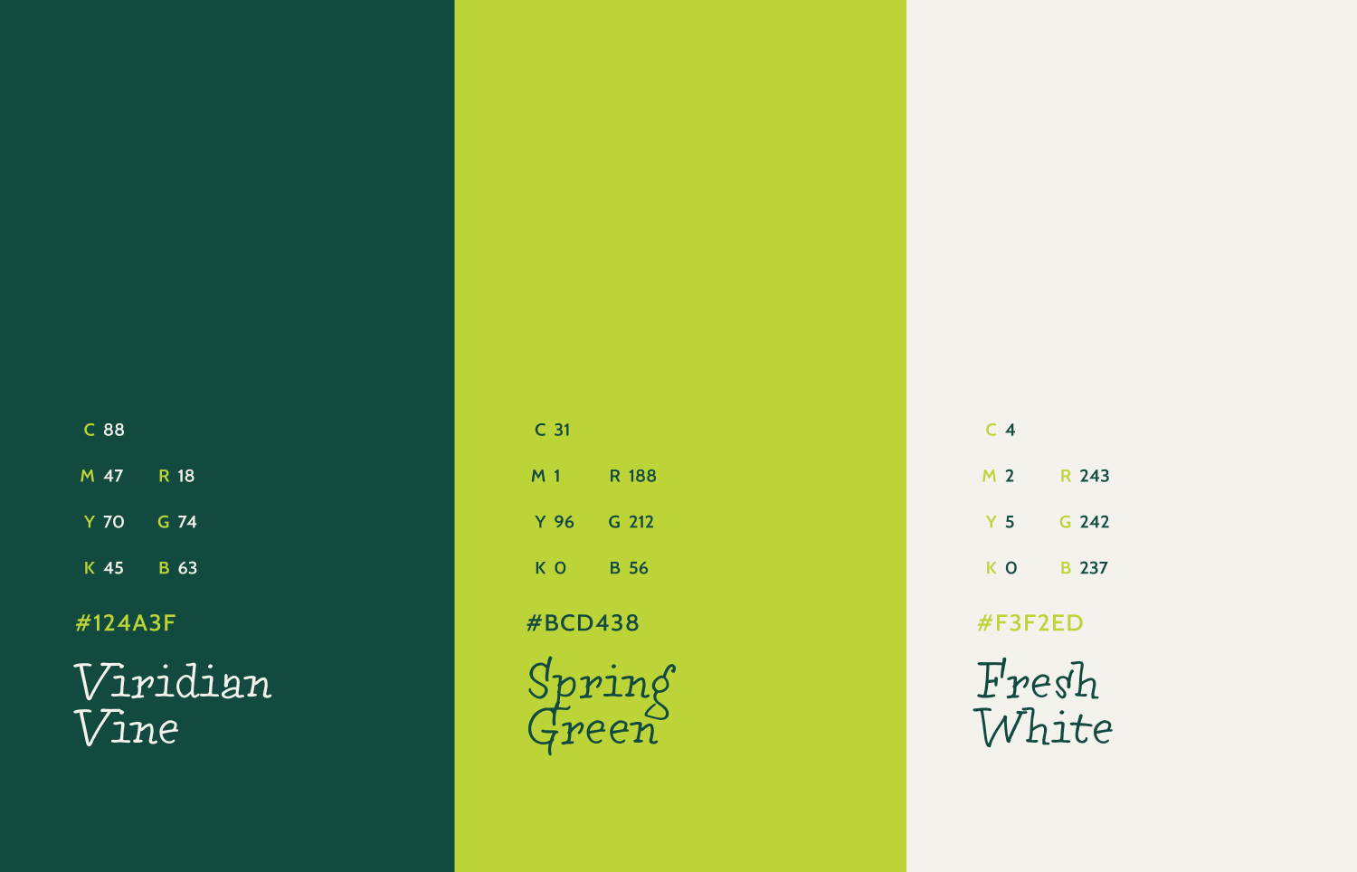
Color played a major role in shaping the brand personality. While green naturally became a core part of the palette, the addition of a bright neon green helped push the identity into a more playful and energetic direction that stood apart from the softer muted palettes commonly seen within plant branding.

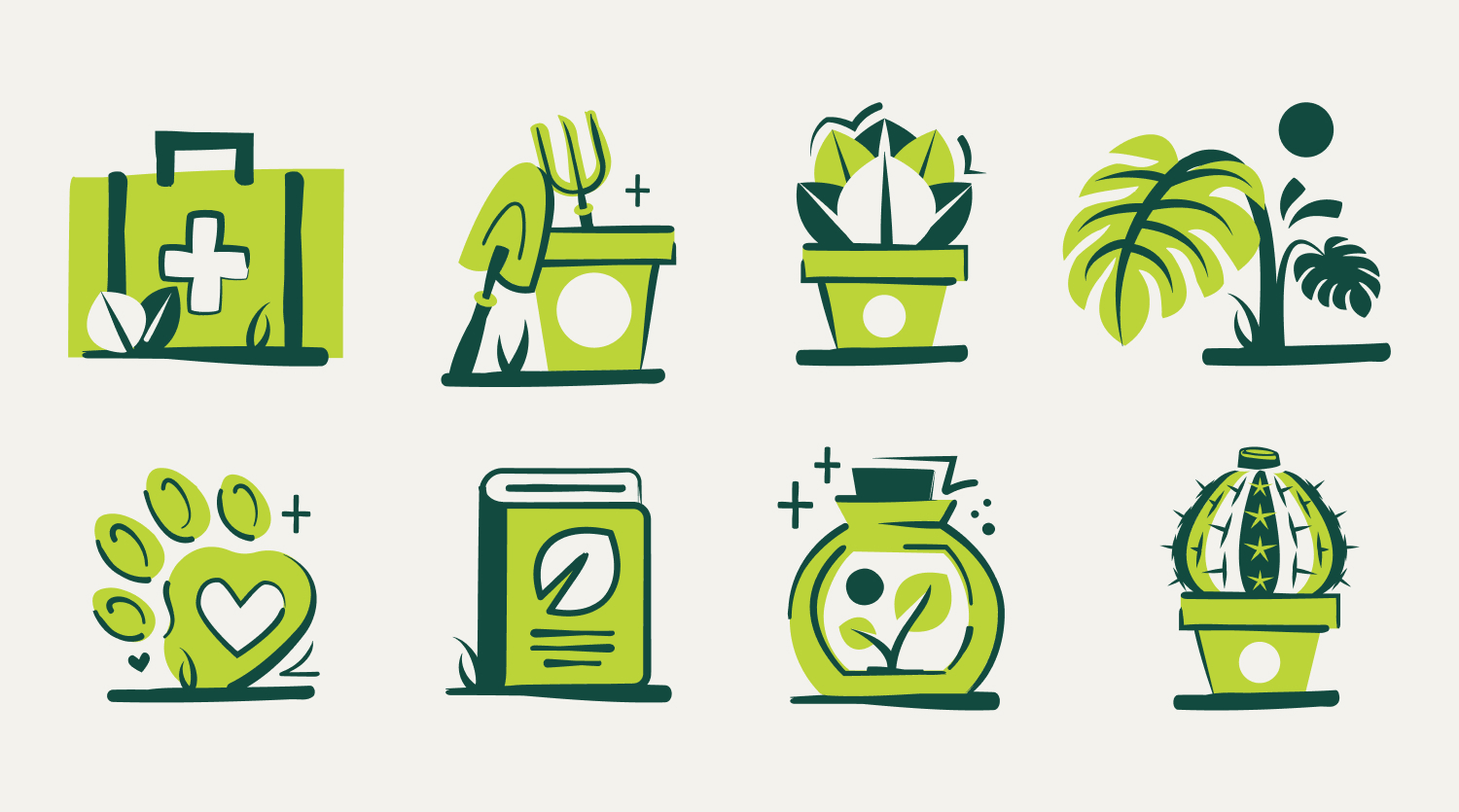
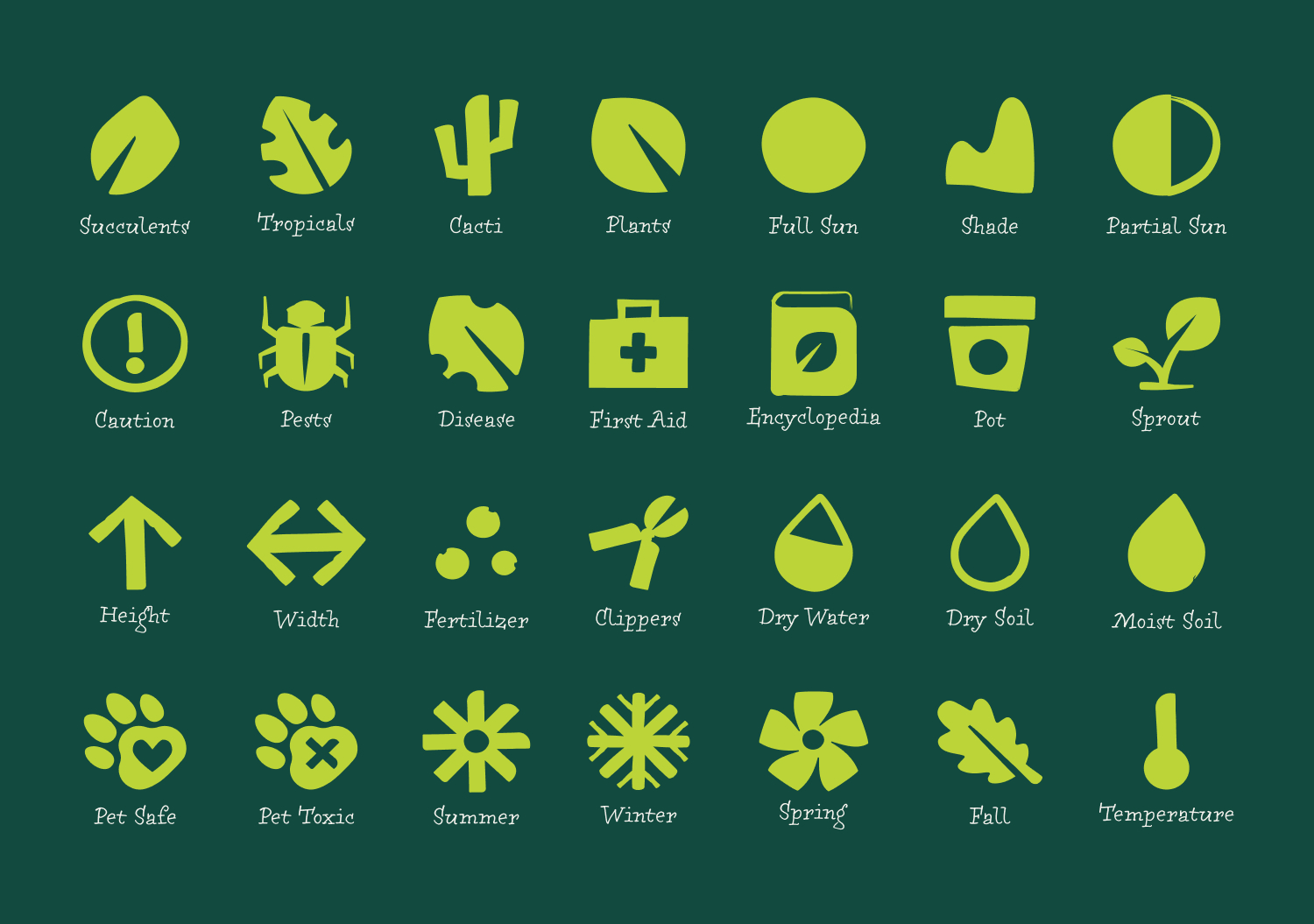
Illustrations and iconography were developed to support both shopping and educational experiences across the brand. Category illustrations helped organize product types throughout the website, while a larger icon system was created to support plant care information and educational resources in a way that felt easy to understand and visually cohesive.
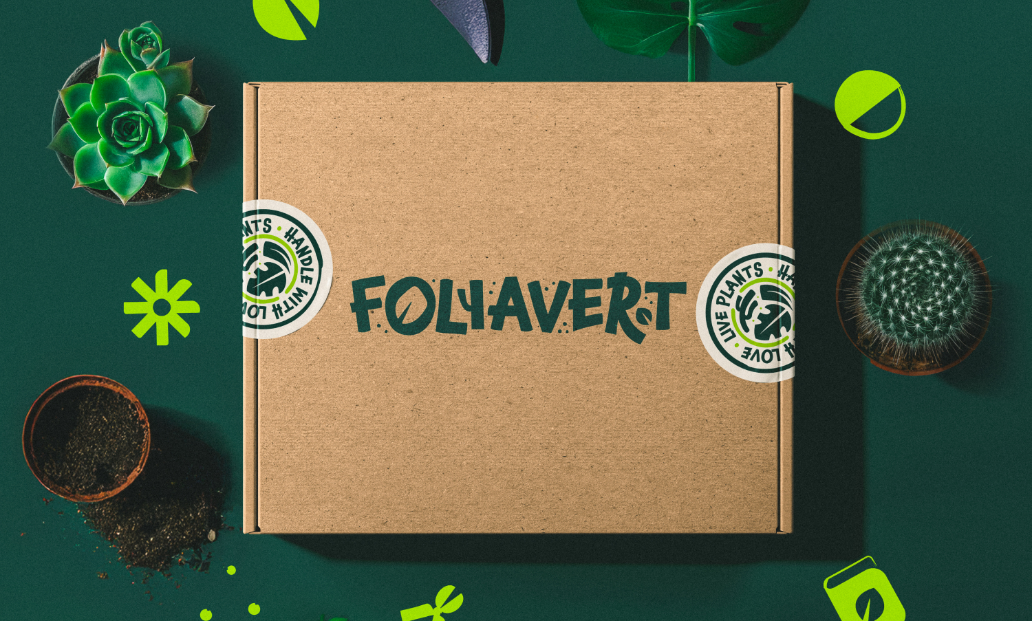
The brand system was designed with scalability and accessibility in mind from the beginning. Because the business operated on a smaller scale, packaging solutions needed to remain affordable and practical while still feeling thoughtful and branded.

The final packaging approach focused on flexible applications that could work across standard kraft shipping boxes and low-cost print materials without sacrificing personality or consistency. Patterns, icons, and supporting illustrations allowed even simple packaging applications to feel recognizable and connected to the larger visual system.

A major focus throughout the project was creating a brand flexible enough to eventually grow into a more fully integrated e-commerce and educational platform. The identity was intentionally built to support future website applications, care guides, social media content, and expanded product categories over time.

The final identity helped position Foliavert as a more approachable and personality-driven alternative within the online plant space while reinforcing the small-scale and community-oriented nature of the business.

One of the strongest aspects of the project was the balance between education and playfulness. The illustration system and educational icons helped make plant care feel more accessible and engaging while still creating a visually cohesive shopping experience.

The custom wordmark also became a defining piece of the brand, successfully scaling across both large-format and smaller applications while giving the identity a distinctive and recognizable presence.