Somatic, Primitive, Untamed Adventure

Heartsong Adventures

Brand Strategy
Visual Identity
Icon System
Brand Guidelines
Illustration
Social Media Templates
Empowering Women in the Wild

Backpacking brand built for women seeking connection, confidence, and a deeper relationship with the wild.

Heartsong Adventures is a women-led backpacking and guiding company based in Salt Lake City, Utah, created to make the outdoors feel more welcoming, empowering, and community-driven for women of all experience levels. The identity was designed to balance rugged outdoor exploration with warmth, personality, and a distinctly feminine point of view.

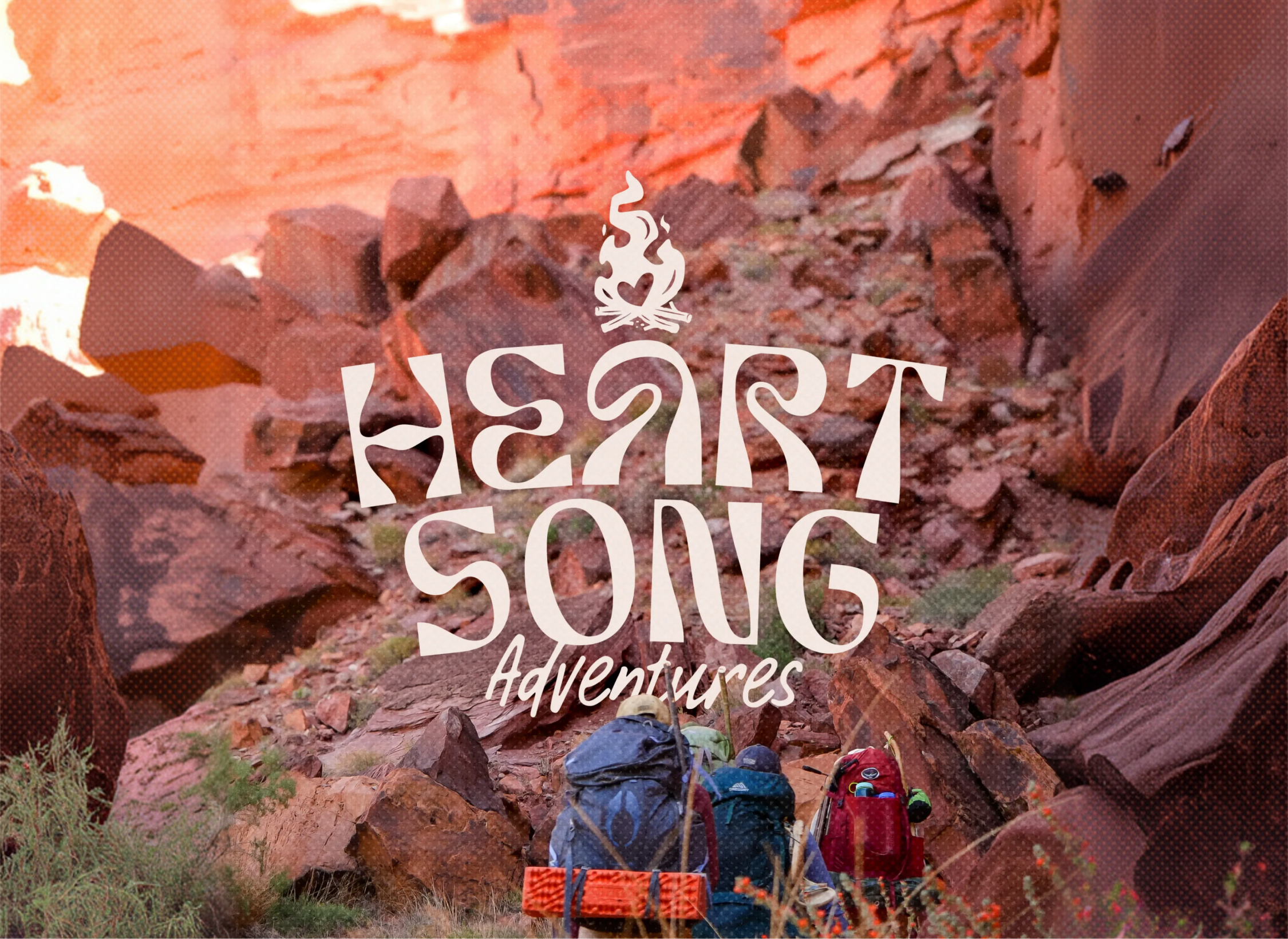
Inspired by the landscapes of the American West and the emotional connection that comes from time spent outdoors, the identity for Heartsong Adventures blends expressive typography, saturated nature-inspired colors, and playful illustration into a flexible brand system built for growth. The result is a brand that feels adventurous and approachable while standing apart from the more traditional aesthetics often seen in the outdoor industry.

Heartsong Adventures was founded by two experienced backpacking guides who met while working together in Colorado and bonded over a shared love for outdoor education, community, and adventure. As they began building their own guiding company, they wanted a brand that reflected both the ruggedness of backcountry exploration and the warmth and connection that made their trips feel different from traditional outdoor experiences.

The challenge was creating an identity that felt feminine and personable without losing credibility within the outdoor space. In a market heavily saturated with overly corporate outdoor brands and predictable mountain-logo aesthetics, the goal became developing something that felt expressive, welcoming, and recognizable while still grounded in real outdoor experience.

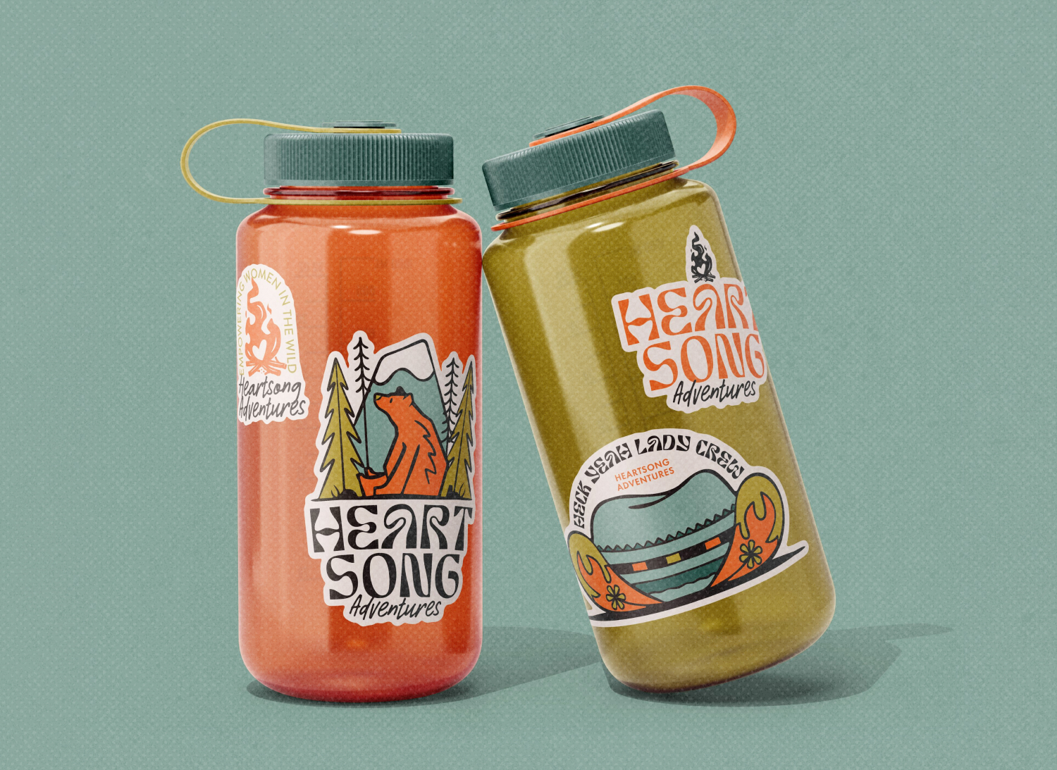
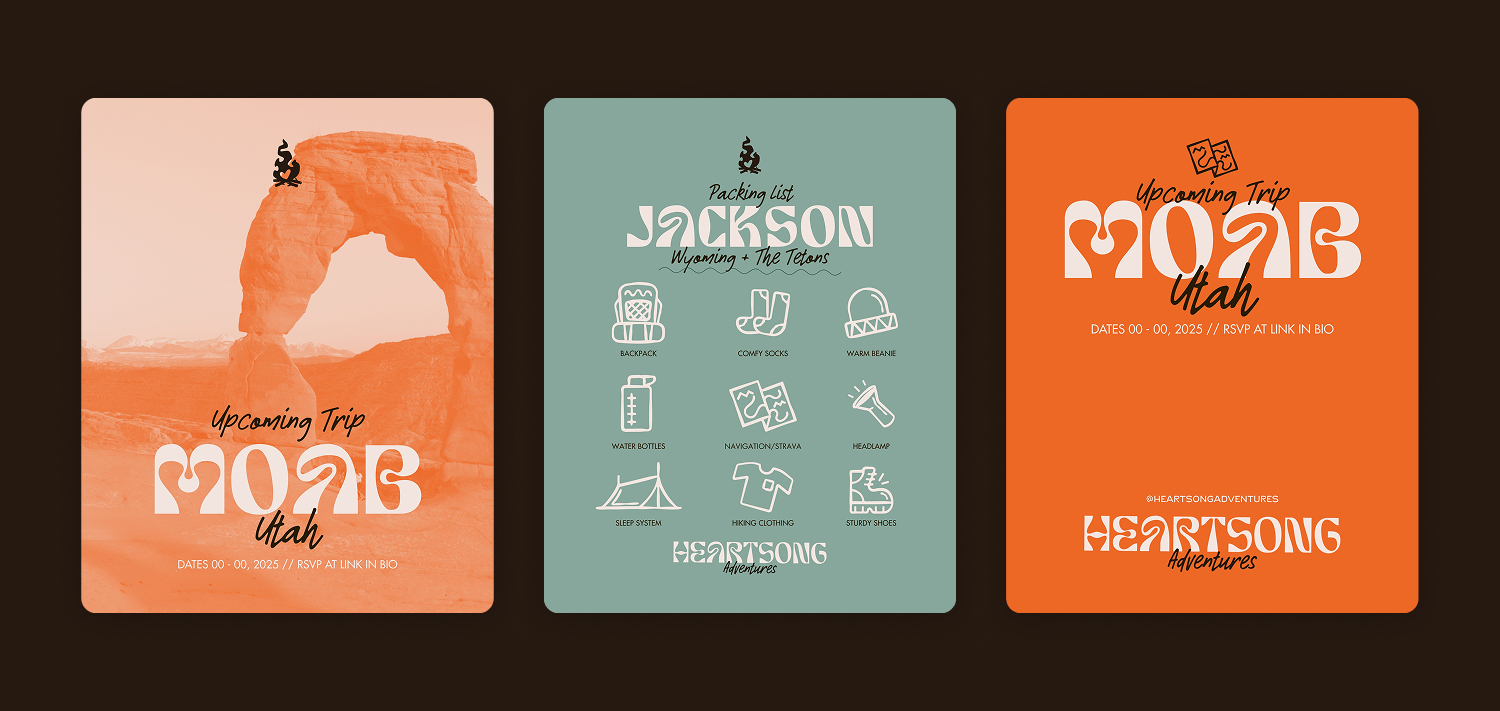
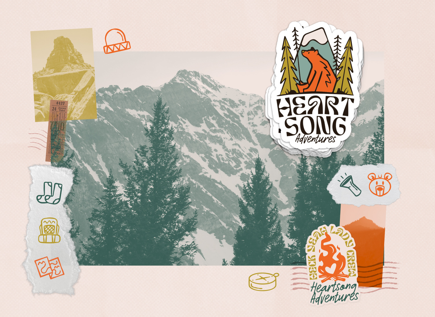
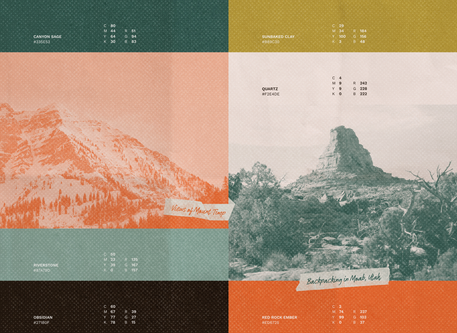
The visual direction drew heavily from the landscapes where the founders guide most often, including the vibrant desert tones of Moab and the cool alpine environments of the Uinta Mountains. Saturated earth tones and expressive textures were used throughout the system to create a sense of warmth, movement, and connection to the natural world.

Typography became a central part of the brand personality. Rather than leaning into rigid or overly polished outdoor branding conventions, the type system was designed to feel free-flowing, organic, and slightly abstract — echoing the forms and movement found in nature while still remaining functional and professional.

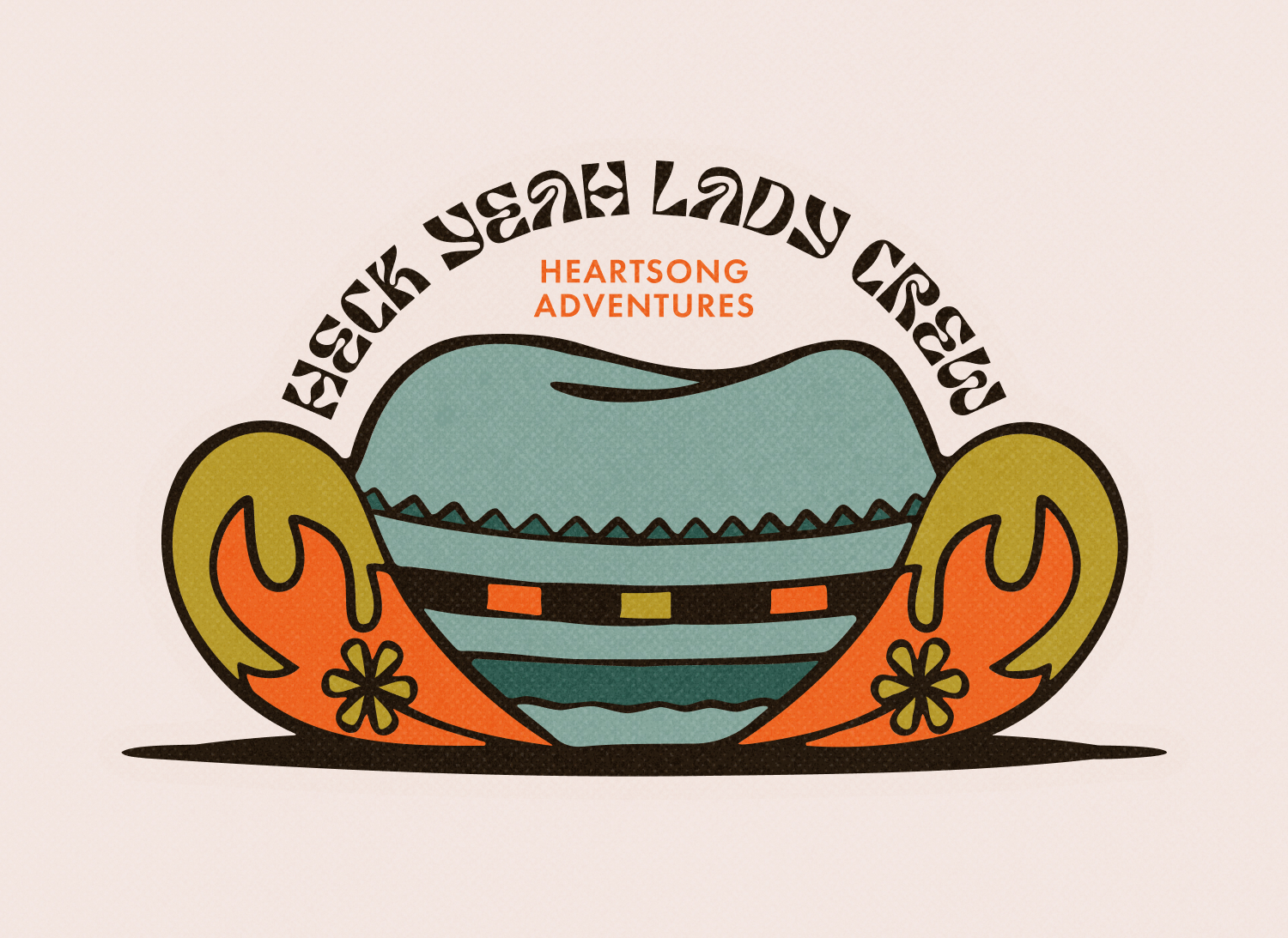
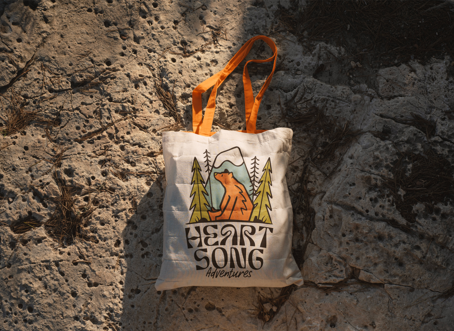
The identity also introduced a series of playful secondary illustrations and sticker-inspired graphics that reflected the founders’ personalities and shared experiences outdoors. Elements like the “Heck Yeah Lady Crew” graphic, a colorful cowgirl hat, and a bear perched in a tree helped bring humor, individuality, and a sense of community into the brand system.

Sophia is hands down the BEST at what she does. Her graphic design skills are unmatched.

I was impressed by the questions she asked in our initial conversation when she was asking about the types of designs I wanted and then her communication throughout the whole process. I COULD NOT be happier with the result!!! Cannot recommend her as a graphic designer enough.

Brooke Zimmerman

Founder + Field Guide, Heartsong Adventures

The brand system was designed to remain flexible as Heartsong Adventures continued to grow. A scalable logo suite, secondary marks, icon system, and social media templates allowed the identity to adapt across digital and physical applications while maintaining consistency.

A major focus throughout the process was balancing softness with strength. The angular simplicity of the primary mark contrasts against the more expressive typography and illustrations, helping the system feel grounded while still carrying a sense of spontaneity and adventure.

The textures integrated throughout the identity also added a tactile quality that helped the digital experience feel more connected to the physical environments that inspired the brand.

The final identity helped establish Heartsong Adventures as a recognizable and credible presence within the outdoor space while reinforcing the welcoming and community-oriented atmosphere the founders wanted to create.

The branding gave the company a stronger foundation for growth across social media, merchandise, trip materials, and future digital experiences. It also created opportunities for smaller touchpoints — like custom stickers and trip graphics — that helped strengthen the sense of connection and shared experience among trip attendees.

One of the most rewarding aspects of the project was seeing the identity exist within the environments that inspired it. Being able to attend one of the company’s backpacking trips and experience the landscapes, energy, and community firsthand added another layer of authenticity and meaning to the work.