Holistic Skateshop approached the project looking to create a merchandise collection that could capture the energy of the local skate scene while feeling welcoming, memorable, and deeply tied to the city of Reading itself.
Because Holistic plays such a significant role within the local skateboarding community — from supporting skaters of all ages to helping drive the creation of a community skatepark — the project needed to feel like more than a standard merch drop. The goal was to create artwork that reflected both the personality of the shop and the people surrounding it.
One of the biggest creative challenges was balancing multiple audiences within the skate community itself. The visuals needed to feel approachable enough for younger skaters and families while still resonating with longtime local skaters and the more rugged culture surrounding skateboarding.
At the same time, the project intentionally avoided darker or overly aggressive visual tropes often associated with skate graphics. Instead, the focus centered on warmth, nostalgia, and community.
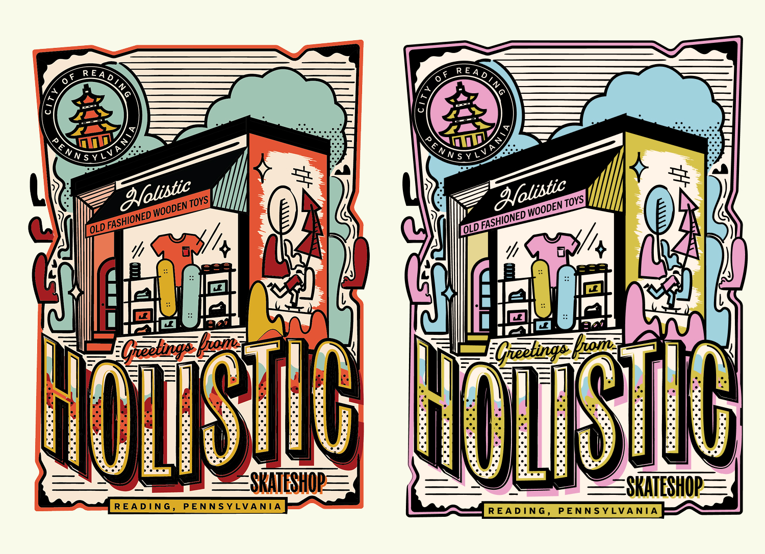
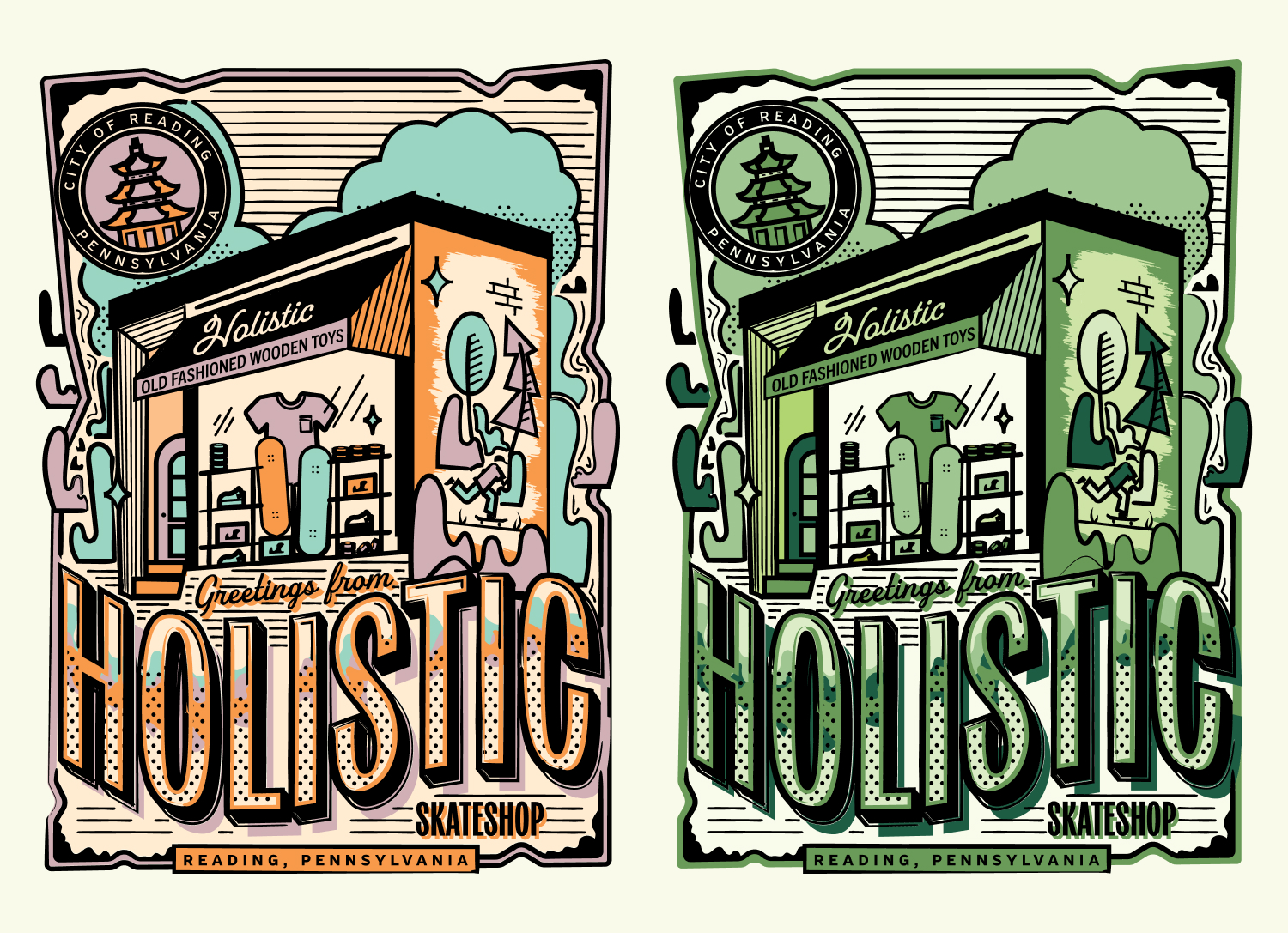
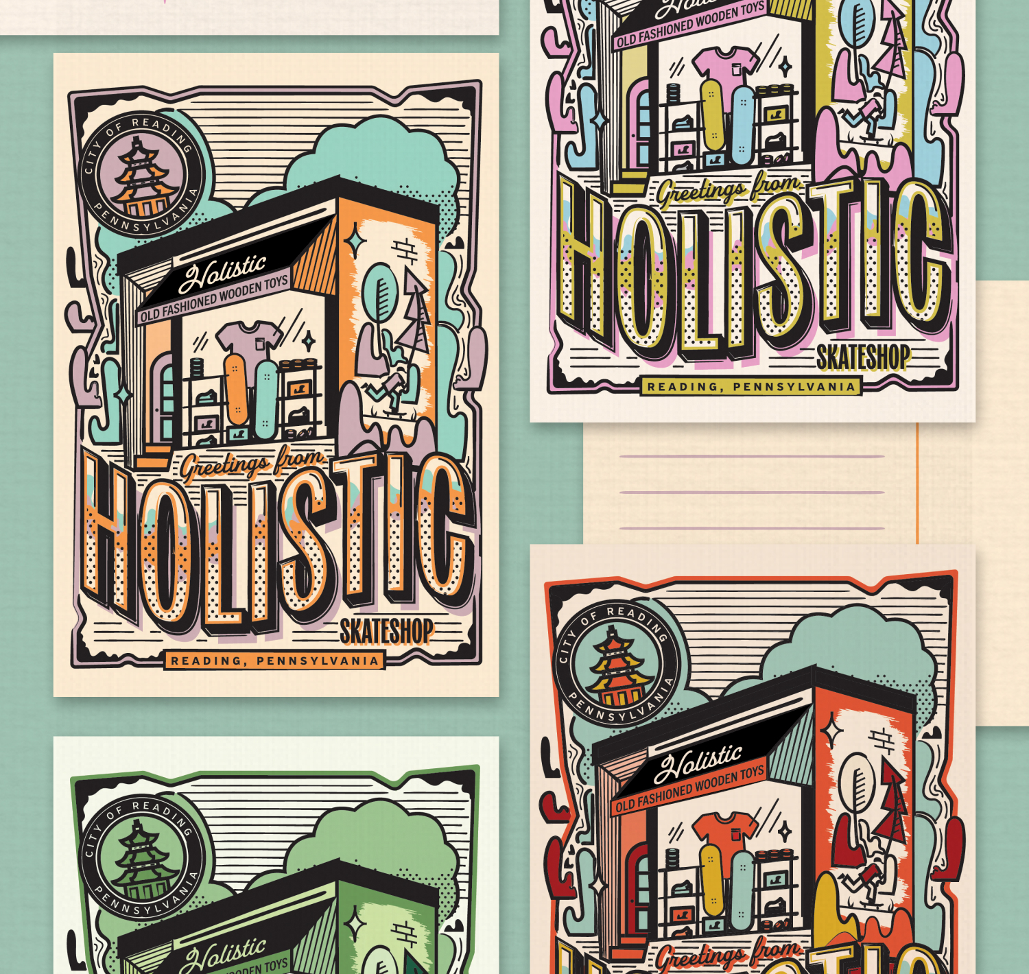
The visual direction drew heavily from vintage postcard design, classic skate graphics, and tactile print textures to create something colorful, personable, and instantly recognizable.
Early concepts explored integrating Reading’s famous Pagoda landmark through more elaborate illustration systems, including geometric dragon imagery and large-scale environmental compositions. While visually exciting, the project ultimately shifted toward a simpler and more grounded direction centered around illustrating the Holistic storefront itself.
That pivot became a defining moment for the project. By focusing directly on the shop, the design transformed into a love letter to the local skate community and the physical place that so many people associated with skateboarding, friendships, and creativity.
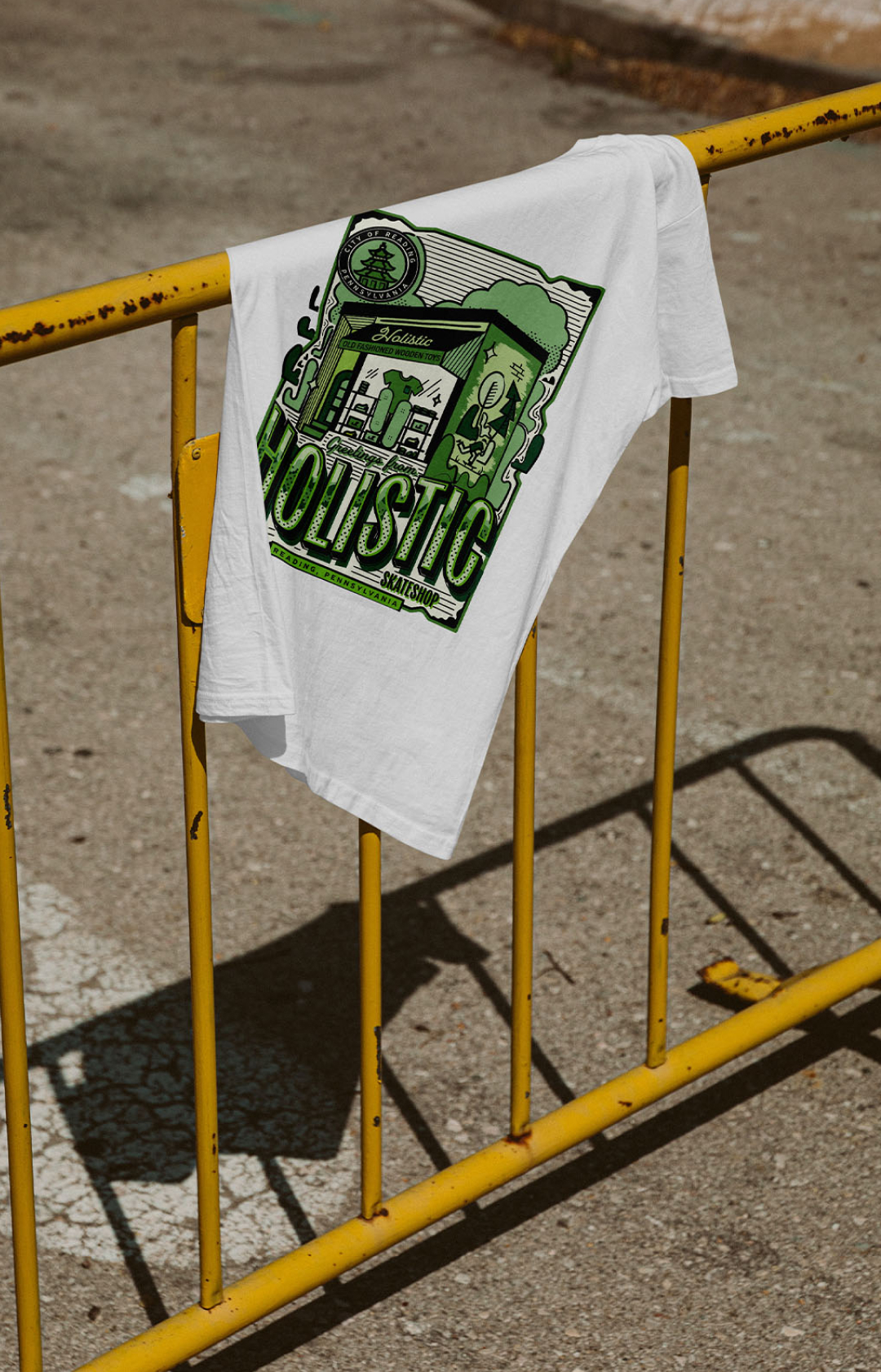
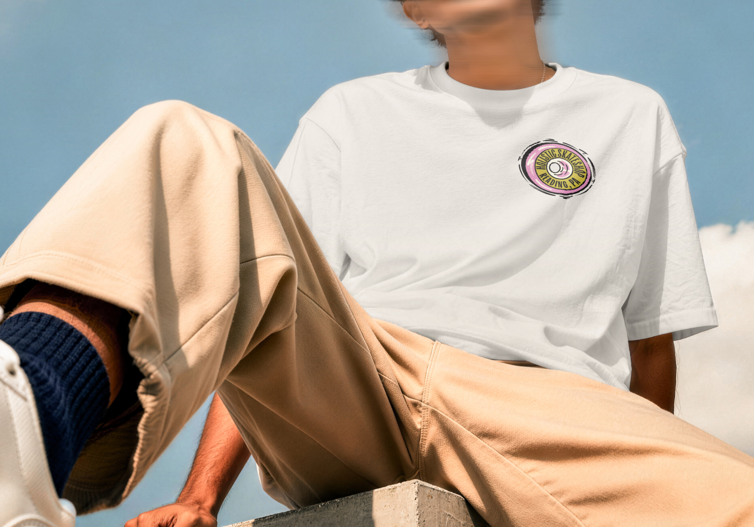
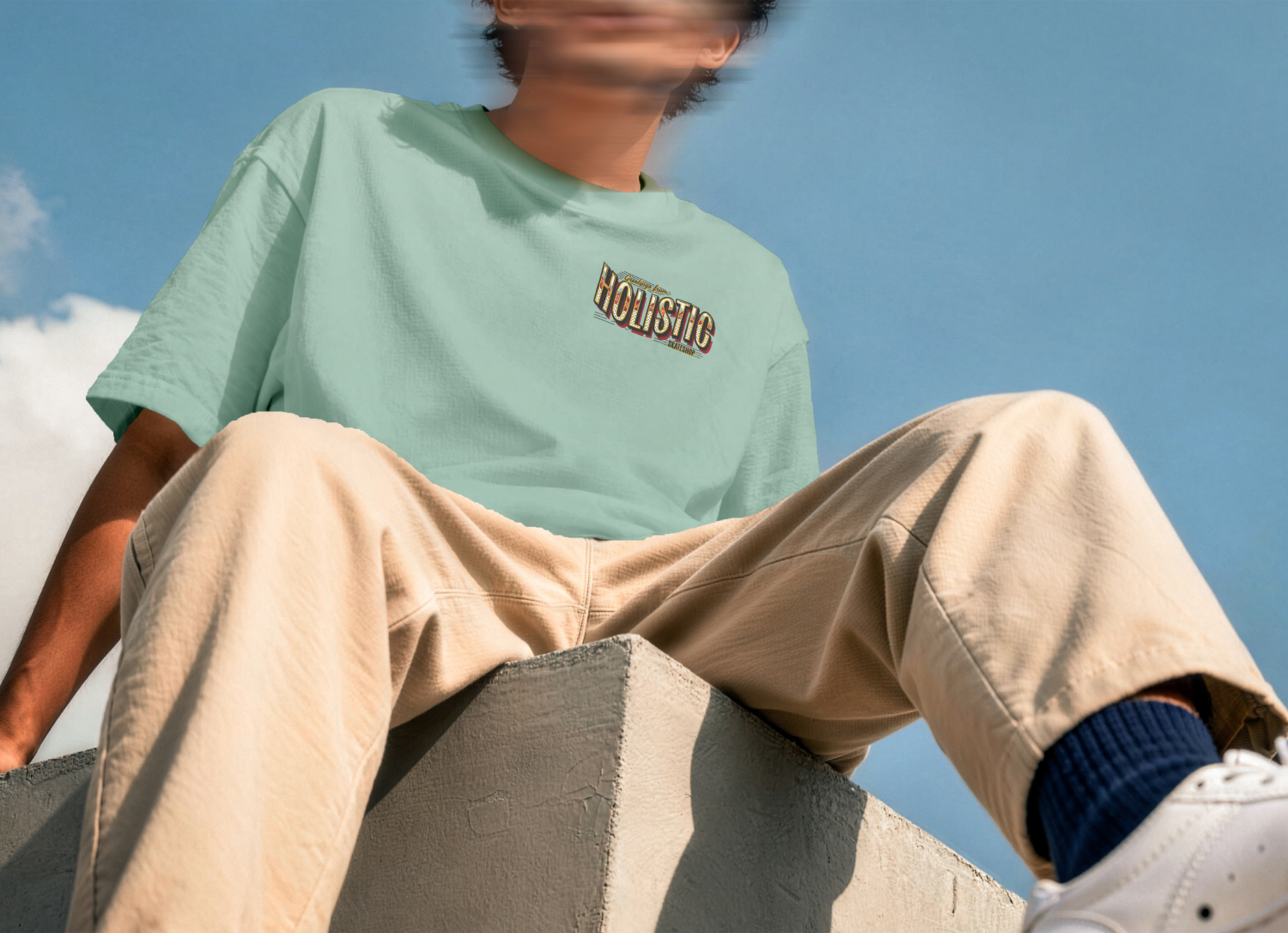
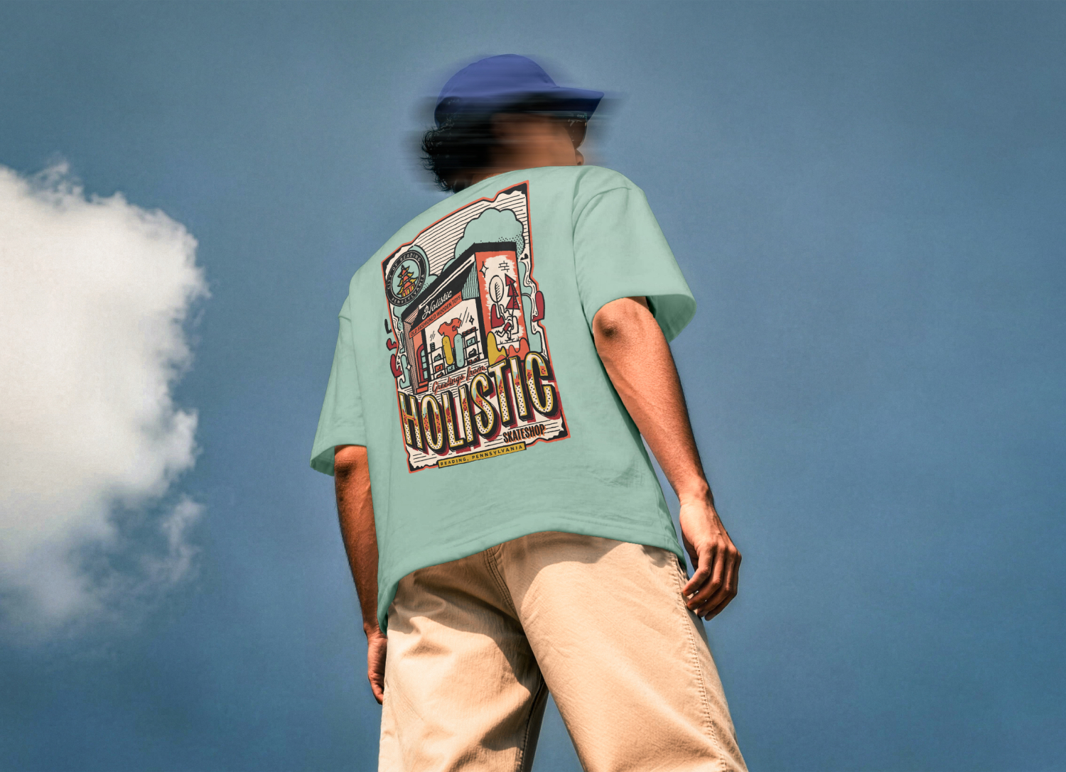
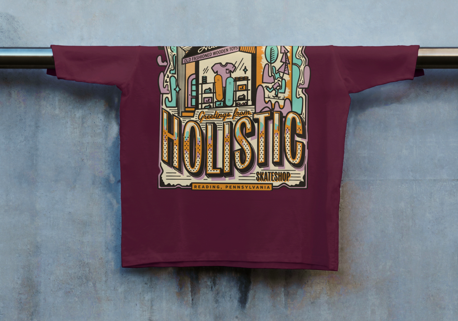
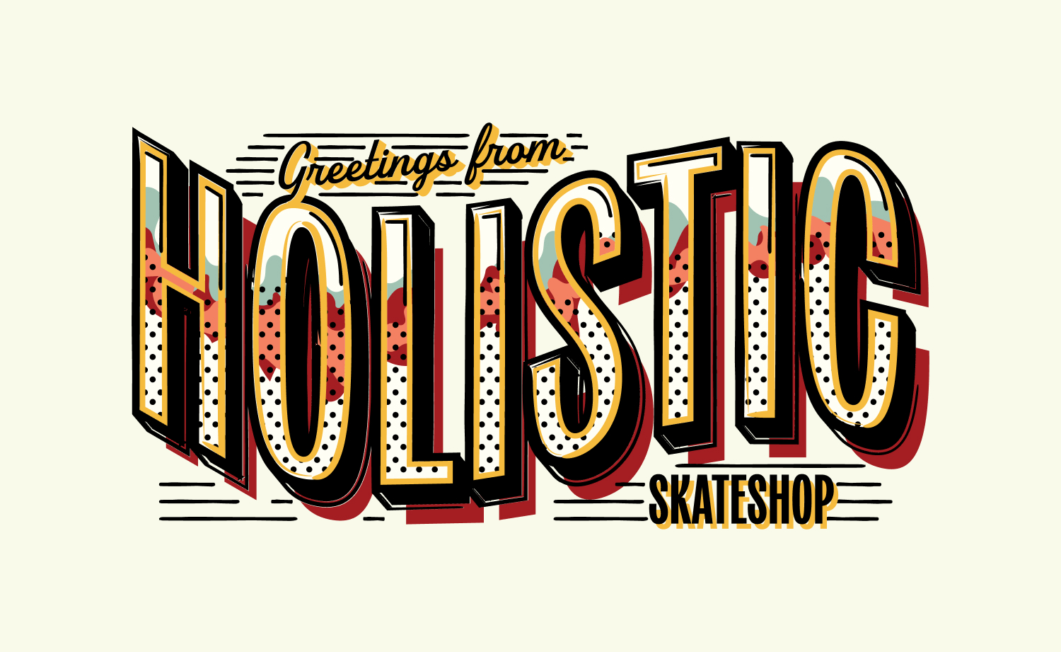
The final illustration used “Greetings From” postcard-inspired typography paired with vibrant storefront artwork and layered textures that helped the design feel nostalgic, screenprinted, and tactile. Multiple colorways were developed throughout the collection to ensure the graphics could resonate across different audiences while working seamlessly on various Comfort Colors apparel options.