

Maggie’s Bistro approached the project looking for a stronger and more recognizable visual identity that could help the restaurant stand out within York’s growing food scene while still feeling approachable and community-oriented.
The existing branding relied heavily on generic stock visuals and lacked the personality needed to communicate what made the restaurant unique: a thoughtful blend of globally inspired flavors, locally sourced ingredients, handcrafted coffee, and a deeply personal story rooted in two different cultural backgrounds.
The challenge became creating an identity system that could balance warmth, professionalism, and playfulness while functioning across everything from menus and packaging to signage and large-scale environmental graphics.
Because much of the restaurant’s audience came from nearby offices and businesses, the branding also needed to feel polished and memorable enough to attract a lunch and brunch crowd without becoming overly corporate or losing its neighborhood charm.
The visual direction centered around creating a brand experience that felt fresh, welcoming, and distinctly personal.
A major source of inspiration came directly from the owners themselves — combining influences from York, Pennsylvania and Thailand into a cohesive visual narrative. This cultural blend became one of the defining aspects of the project and heavily influenced the mural illustrations, color palette, and overall atmosphere of the identity.
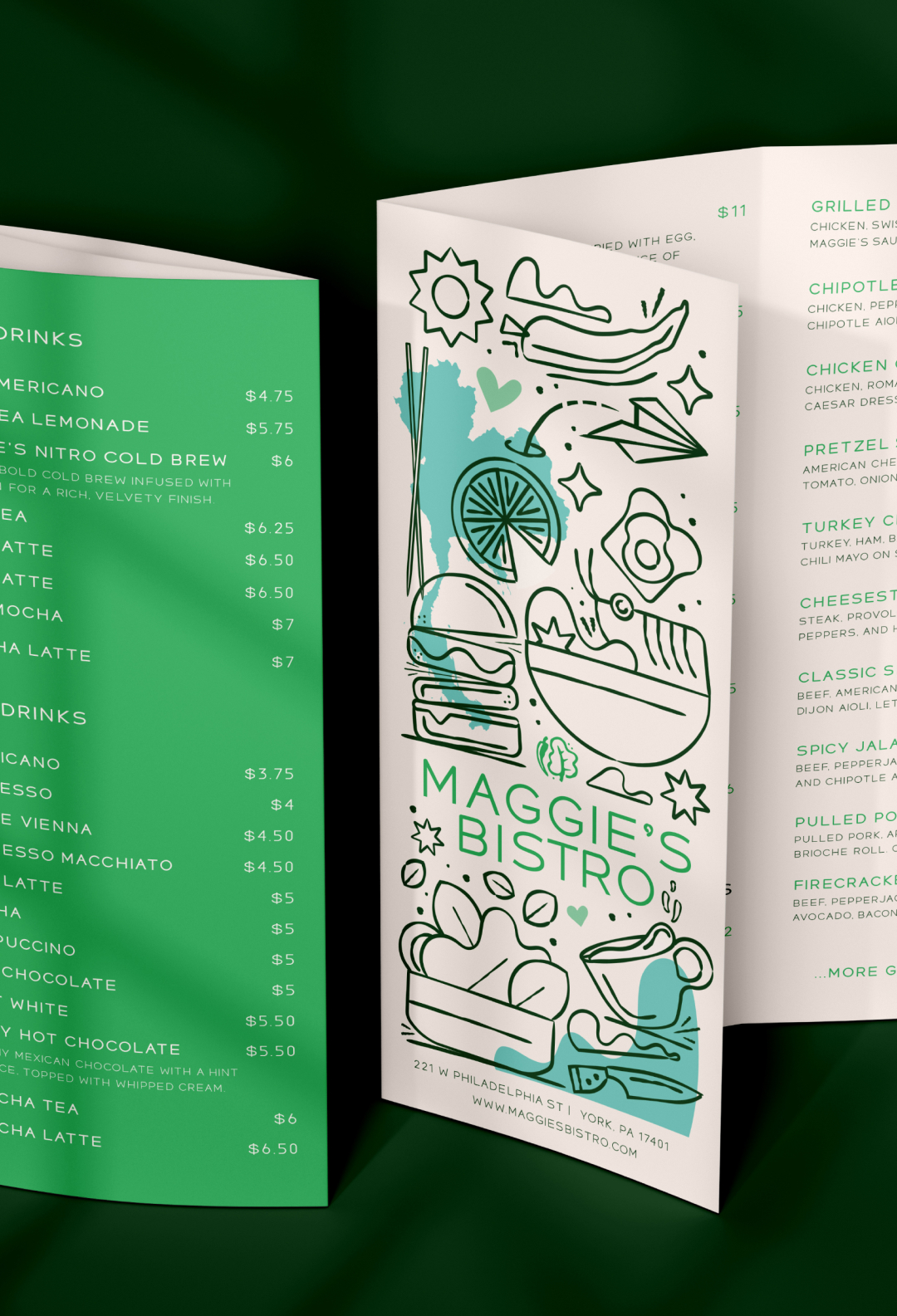
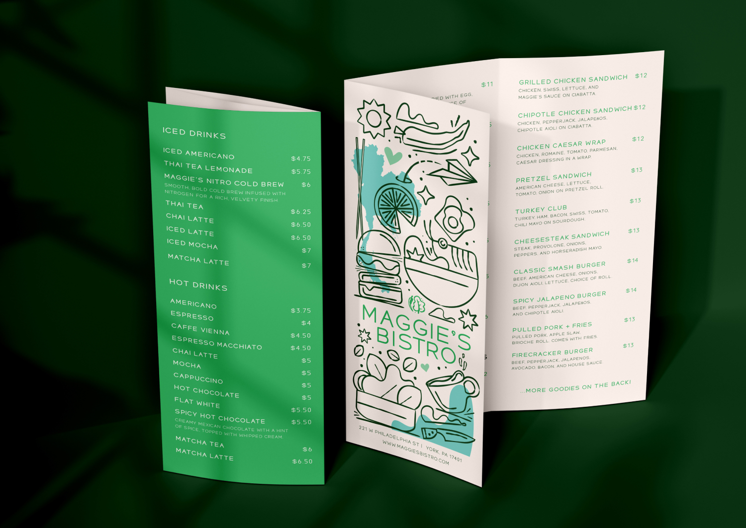
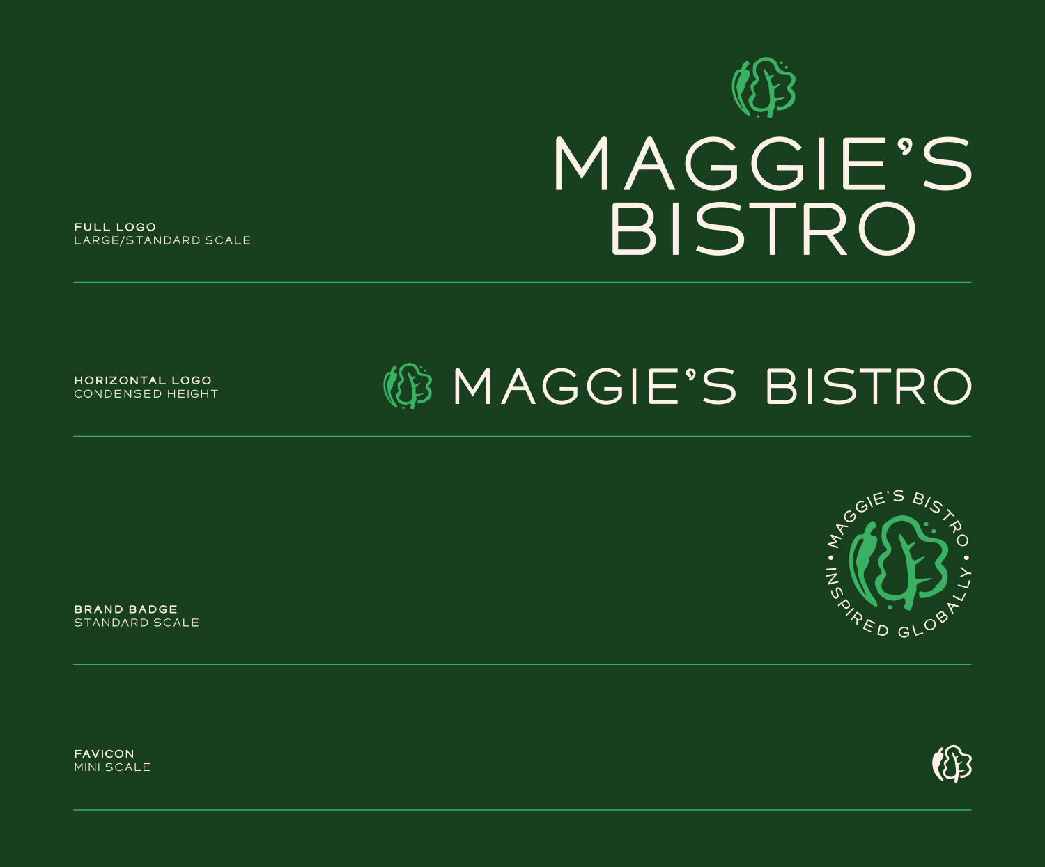
The final system moved away from the ornate filigree and generic styling used in the original branding and instead introduced cleaner, more modern typography paired with expressive illustrations and playful environmental graphics.
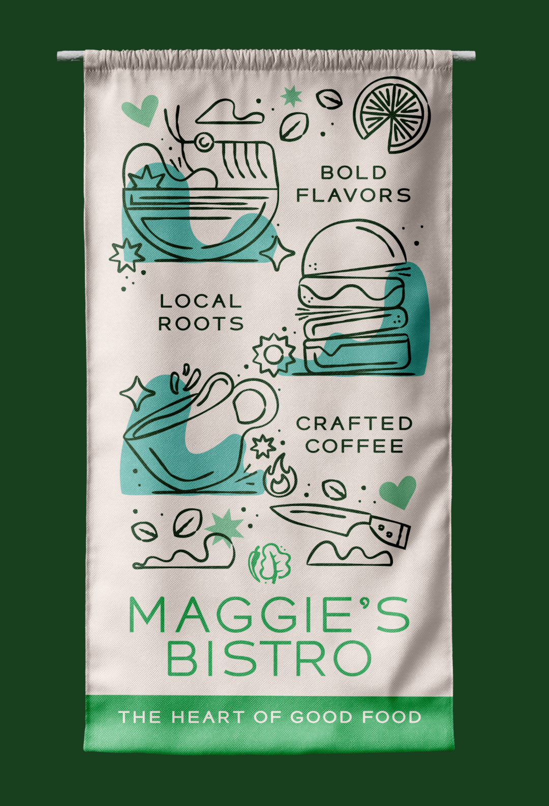
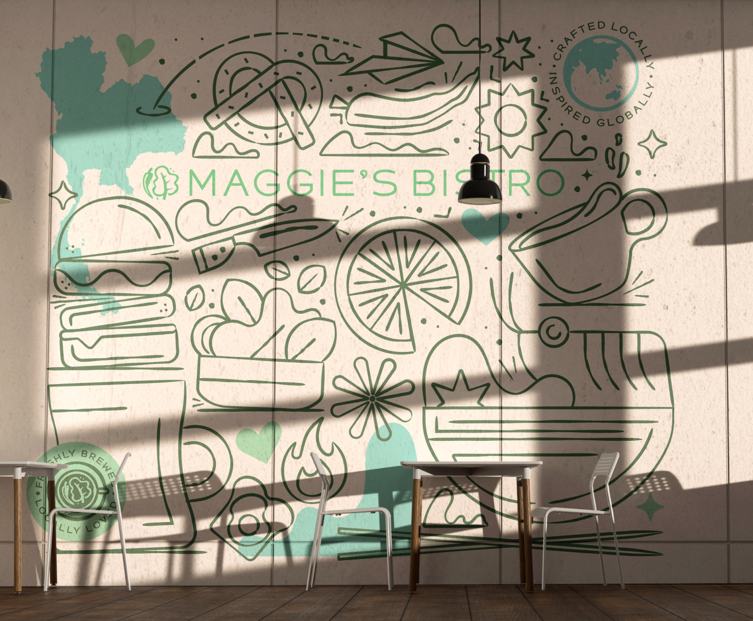
One of the most defining elements of the project became the large-scale mural system created for the restaurant interior. The mural featured illustrated menu items, movement-based graphic elements, and a paper airplane traveling from an outline of Thailand across the space — visually tying together the restaurant’s local roots and global culinary influences.
Color choices were intentionally bright, warm, and ingredient-inspired, helping reinforce the freshness and vibrancy of the food while bringing energy and visibility into the restaurant environment.