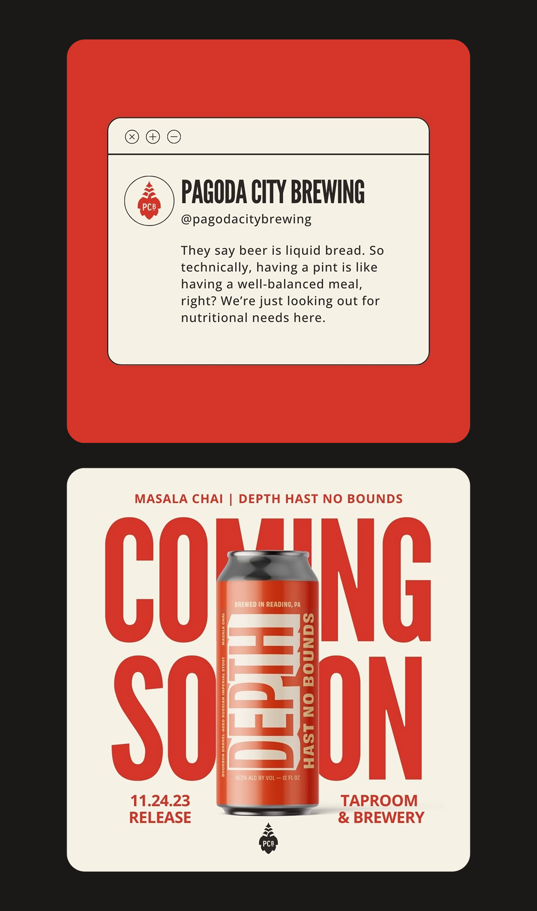
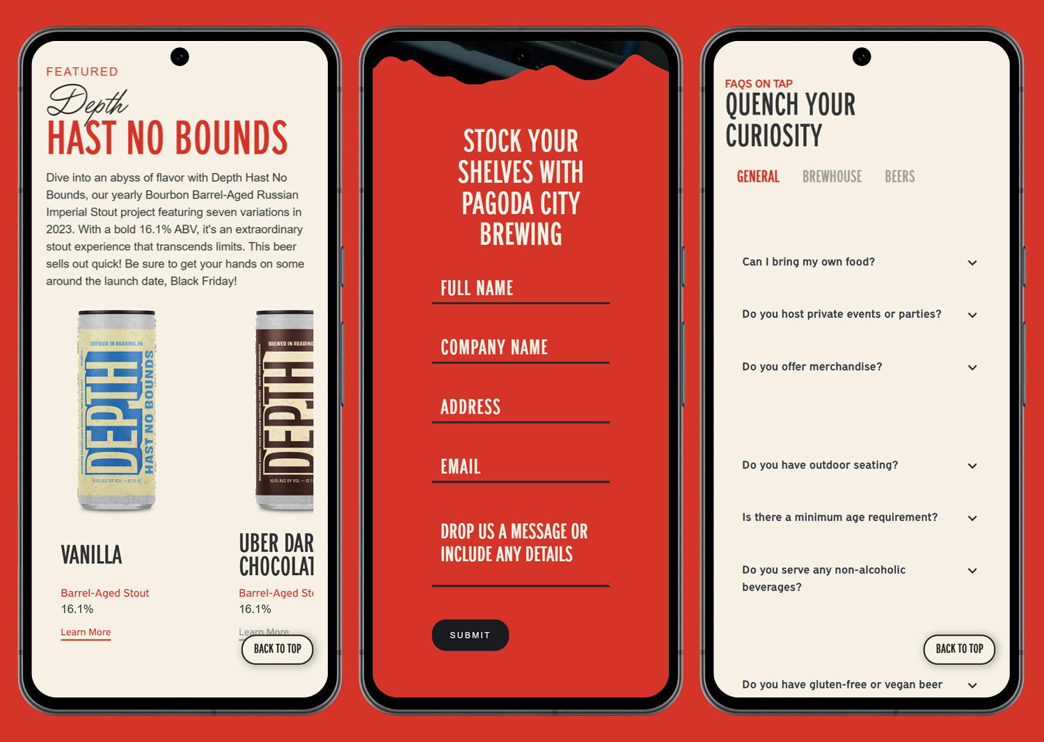
Pagoda City Brewing entered the market as a new brewery backed by an established local restaurant and brewing group, with the goal of creating a strong, memorable presence within an already competitive craft beer landscape.
While the business itself had credibility and operational strength, the brand needed a distinct identity that could immediately communicate personality, local pride, and quality. The challenge was to create a system that felt bold and recognizable enough to stand out in a crowded brewing scene while still feeling welcoming and rooted in the community of Reading, Pennsylvania.
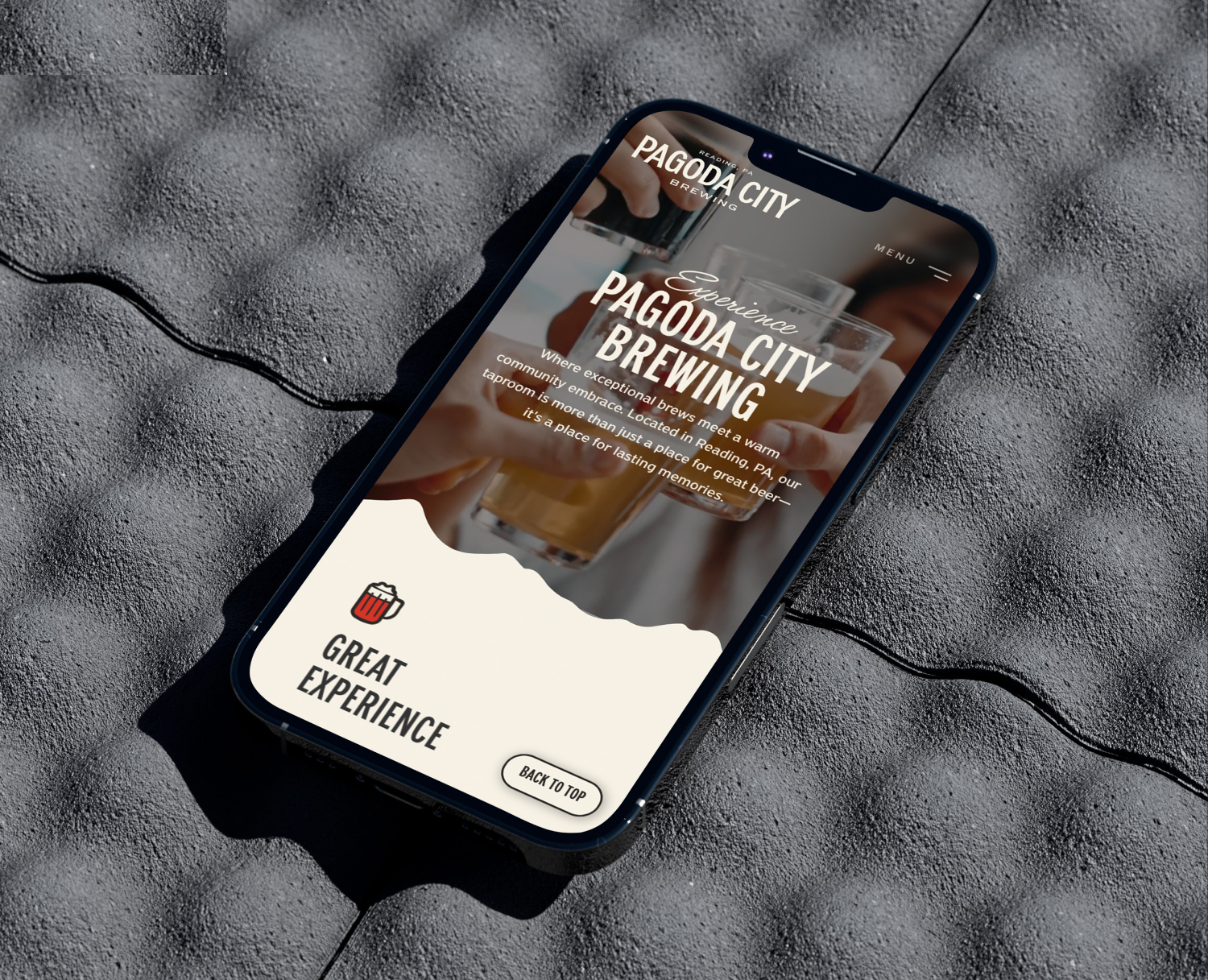
An additional challenge came from the brewery’s physical location — a large warehouse space that required strong visual presence from a distance, as well as a digital experience that could clearly communicate offerings, updates, and brand personality to both locals and visitors.
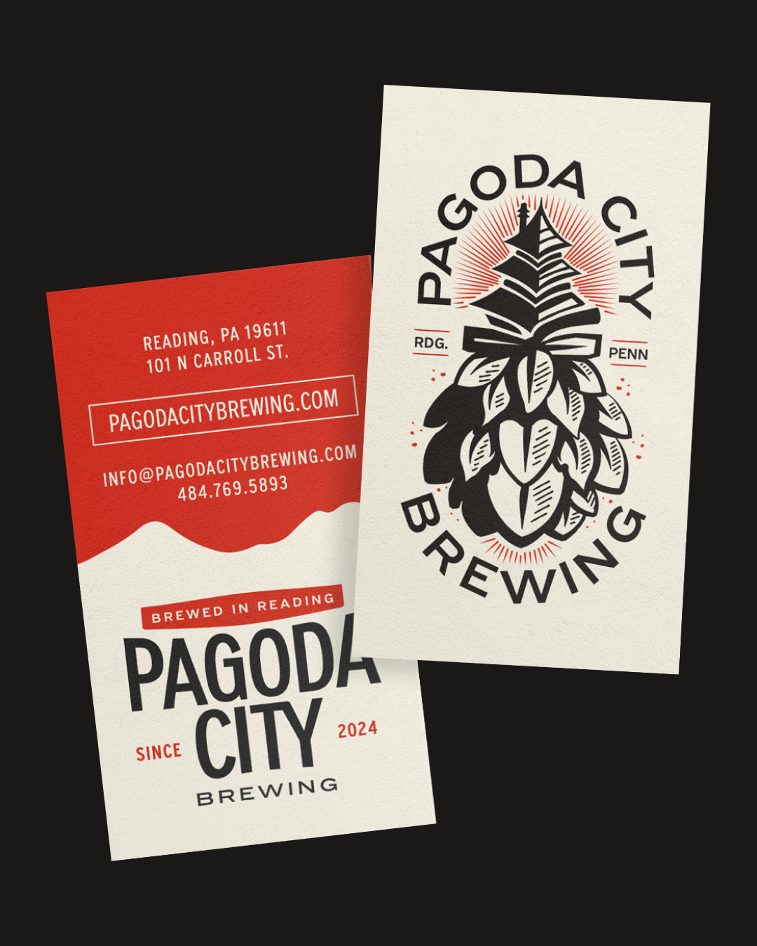
The visual direction was deeply inspired by Reading’s most recognizable landmark, the historic Japanese-style pagoda overlooking the city. Because this symbol is widely used throughout the region, the goal was to reinterpret it in a way that felt specific, ownable, and uniquely tied to the brewery itself.
The final brand mark combined a stylized pagoda silhouette with a hop icon, developed in a woodcut-inspired illustrative style. This approach helped ground the identity in craft tradition while giving it a distinctive visual signature that could scale across packaging, signage, and digital applications.
Typography played a key role in balancing the system. A condensed sans-serif typeface provided structure, clarity, and modern impact, while supporting script elements on the website introduced warmth and personality, helping soften the overall tone and reflect the hospitality of the brewery experience.
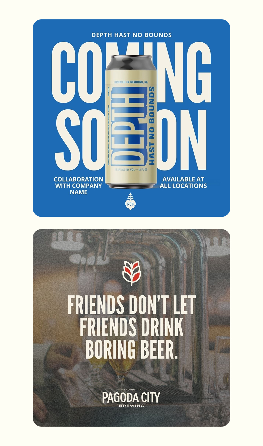
The color palette of red, cream, and black was chosen to create immediate visual contrast and recognition, while also referencing both traditional design influences and the bold energy of the brewery’s physical environment.