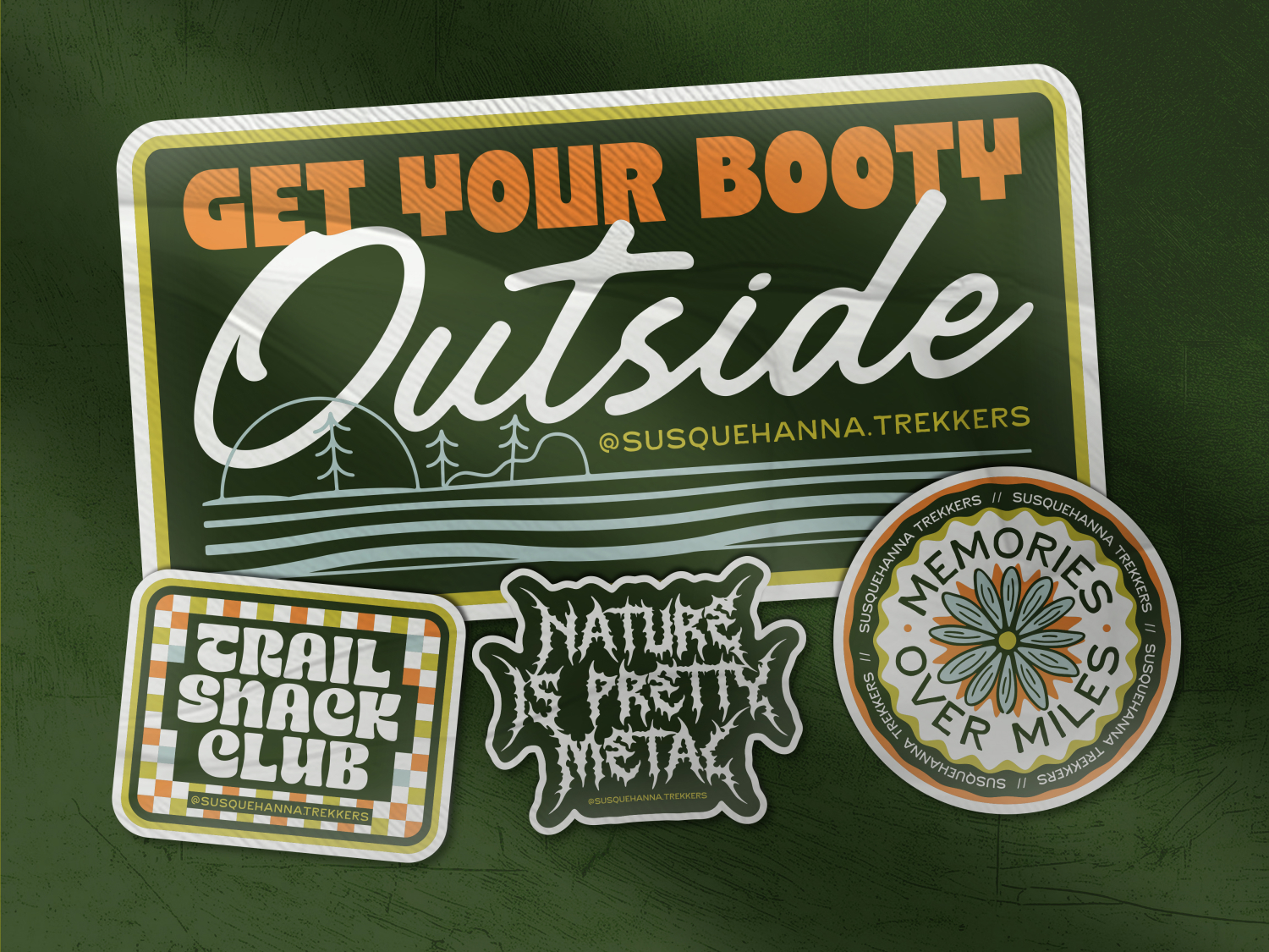
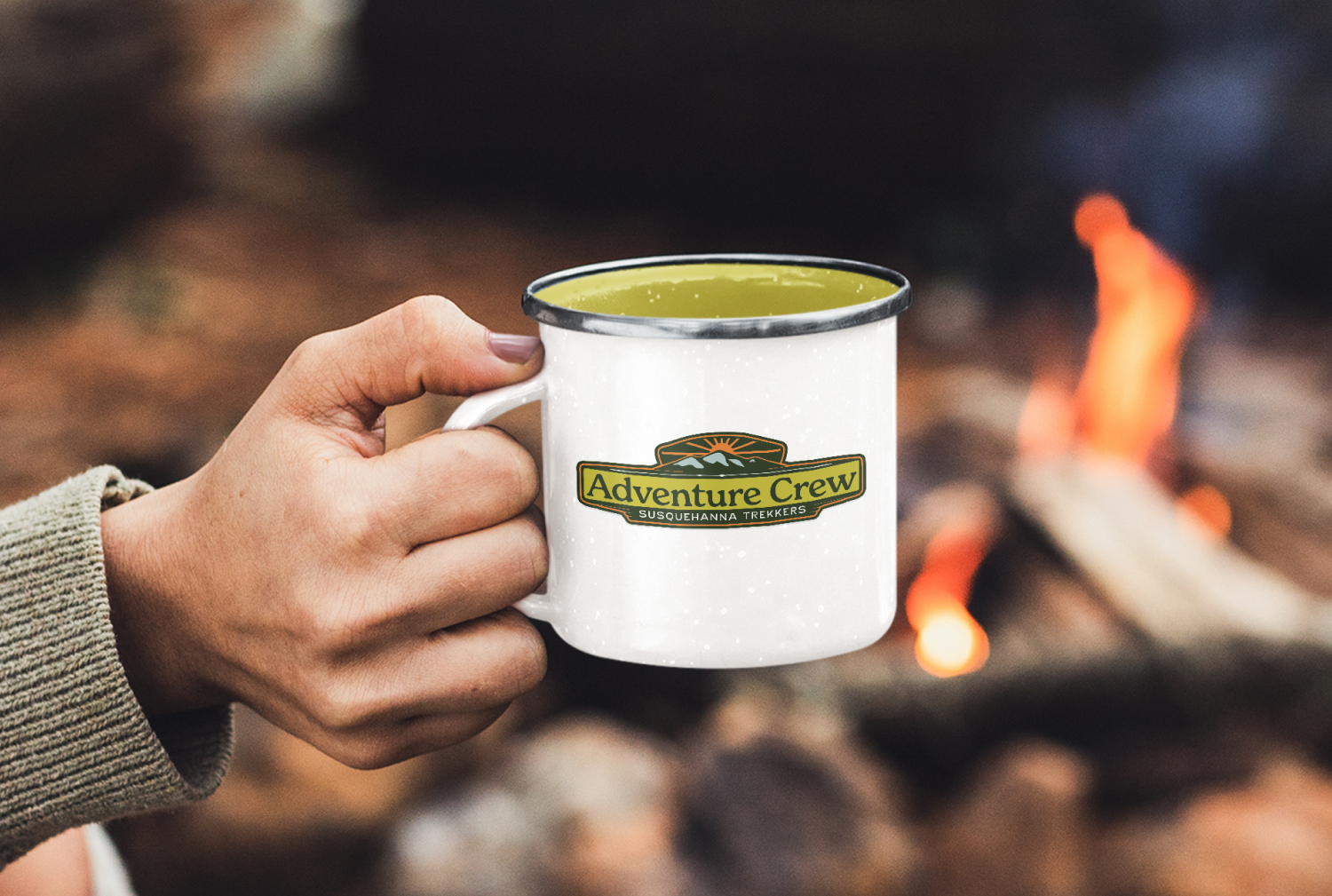
What began as a small branding project for a new local adventure club quickly expanded into a growing visual system spanning social media, merch, event graphics, and community touchpoints. Inspired by the rugged terrain, local history, and vibrant outdoor culture of Central Pennsylvania, the identity balances vintage-inspired typography with playful illustration to create a brand that feels welcoming, recognizable, and built to grow alongside its community.
As a newly forming outdoor club in Lancaster County, Susquehanna Trekkers needed an identity that could immediately establish credibility while still feeling approachable and community-focused. The outdoor groups already existing in the area often felt more traditional or geared toward older audiences, so the challenge became creating something that felt younger, more energetic, and deeply connected to the local outdoor scene without relying on overly trendy design choices.
The identity needed to capture the spirit of the club itself: adventurous, welcoming, slightly rugged, and driven by a genuine love for local exploration.
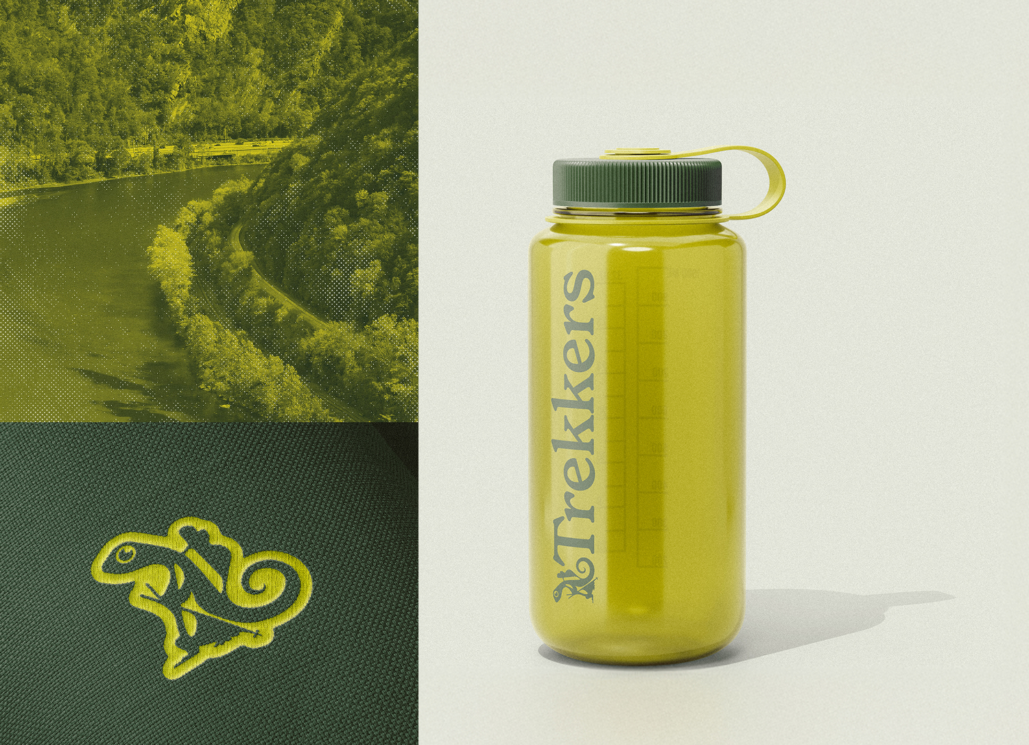
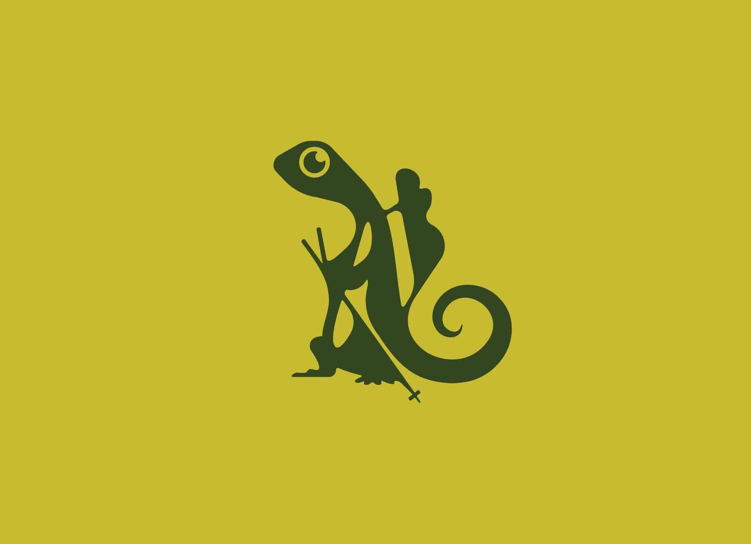
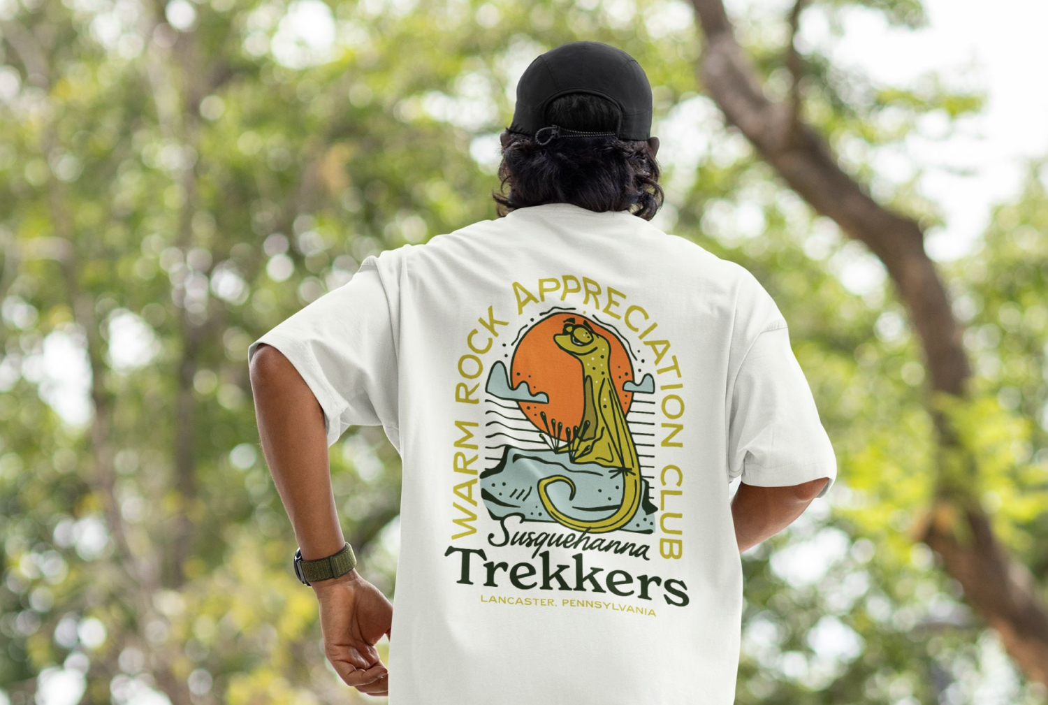
The visual direction pulled heavily from the surrounding region - both environmentally and historically. Vintage-inspired typography referenced the area’s historical roots while helping the brand feel timeless and grounded. To balance that structure with something more playful and personable, the system introduced Rokko, an eastern newt mascot inspired by a species commonly found throughout the trails and waterways where the club hikes and explores.
The combination of expressive illustration and heritage-inspired typography helped create a brand that felt distinctively local while still approachable to a younger audience.
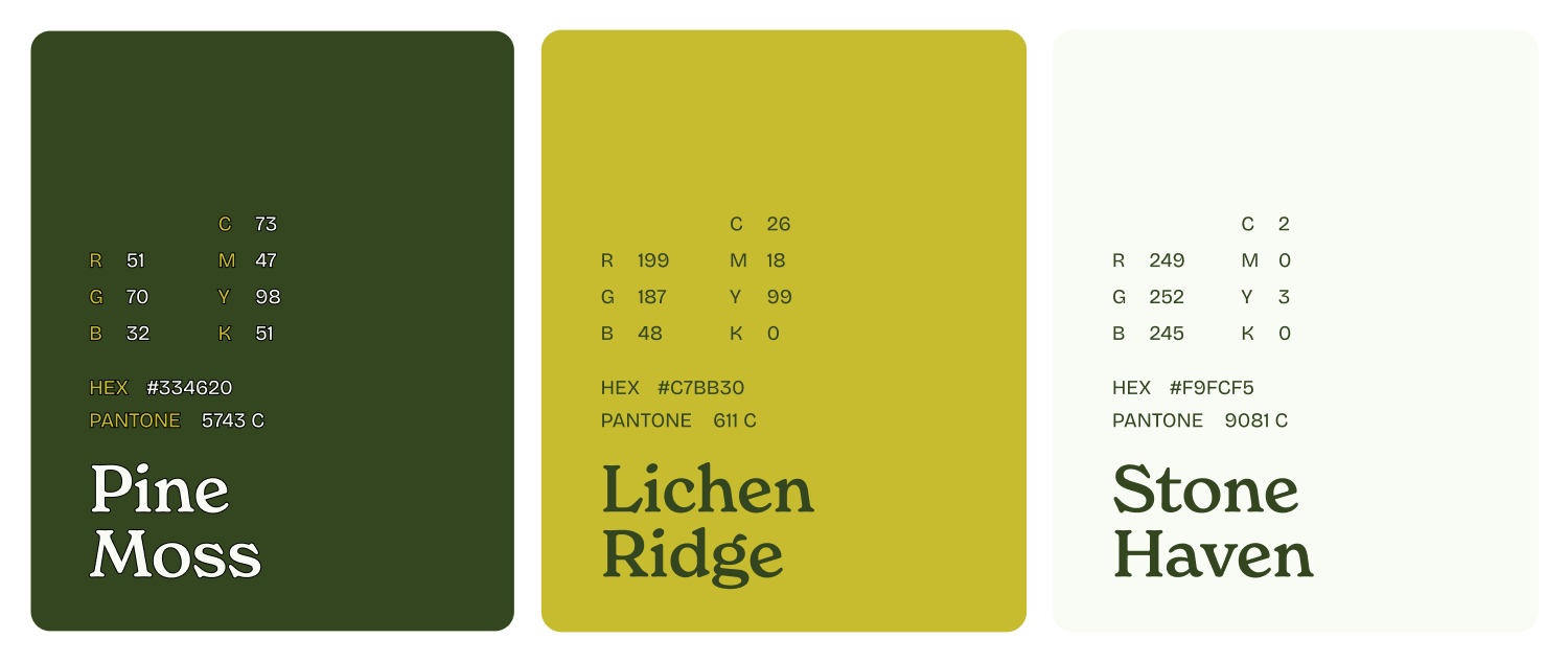
The color palette was inspired by the vibrant greens and seasonal landscapes of Pennsylvania, pairing deep forest tones with a bright pollen yellow to bring warmth and energy across social graphics, merchandise, and event materials year-round.